Explore the hospital effect on thrombolysis use, using SHAP main effects from a single XGBoost model#
Research question: What’s the difference between the SHAP main effect for patients that attend a hospital, with the SHAP main effect for patients that do not attend a hospital
Plain English summary#
When fitting a machine learning model to data to make a prediction, it is now possible, with the use of the SHAP library, to allocate contributions of the prediction onto the feature values. This means that we can now turn these black box methods into transparent models and describe what the model used to obtain it’s prediction.
SHAP values are calculated for each feature of each instance for a fitted model. In addition there is the SHAP base value which is the same value for all of the instances. The base value represents the models best guess for any instance without any extra knowledge about the instance (this can also be thought of as the “expected value”). It is possible to obtain the models prediction of an instance by taking the sum of the SHAP base value and each of the SHAP values for the features. This allows the prediction from a model to be transparant, and we can rank the features by their importance in determining the prediction for each instance.
The SHAP values for each feature are comprised of the feature’s main effect (what is due to the feature value, the standalone effect) and all of the pairwise interaction effects with each of the other features (a value per feature pairings).
Here we will calculate the SHAP interactions for the single XGBoost model trained on all of the data, no test set (from notebook 03a). We will focus on understanding the SHAP main effect for each of the one-hot encoded hosptial features that make up the Stroke team categorical feature. For example, what is the range of SHAP main effect values for patients that attend the hospital, and for those that do not.
(Note: This notebook is repeating the analysis in notebook 03b, using SHAP main effect instead of SHAP values for the one-hot encoded hospital features).
SHAP values are in the same units as the model output (for XGBoost these are in log odds).
Model and data#
Using the XGBoost model trained on all of the data (no test set used) from notebook 03a_xgb_combined_shap_key_features.ipynb. The 10 features in the model are:
Arrival-to-scan time: Time from arrival at hospital to scan (mins)
Infarction: Stroke type (1 = infarction, 0 = haemorrhage)
Stroke severity: Stroke severity (NIHSS) on arrival
Precise onset time: Onset time type (1 = precise, 0 = best estimate)
Prior disability level: Disability level (modified Rankin Scale) before stroke
Stroke team: Stroke team attended
Use of AF anticoagulents: Use of atrial fibrillation anticoagulant (1 = Yes, 0 = No)
Onset-to-arrival time: Time from onset of stroke to arrival at hospital (mins)
Onset during sleep: Did stroke occur in sleep?
Age: Age (as middle of 5 year age bands)
And one target feature:
Thrombolysis: Did the patient recieve thrombolysis (0 = No, 1 = Yes)
Aims#
Using XGBoost model fitted on all the data (no test set) using 10 features
Calculate the SHAP interaction values
Understand the SHAP main effect values for the hospital one-hot encoded features
Observations#
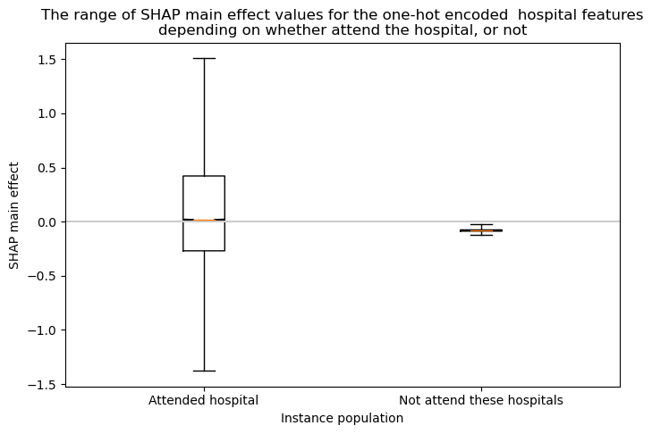
SHAP main effect values for the one-hot encoded hospital features are very dependent on whether the instance attended the hospital or not
SHAP main effect values for the attended one-hot encoded hospital feature are largely one side of zero or the other. There are fewer instances in this population, but the range of SHAP values is wider.
SHAP main effect values for the not attended one-hot encoded hospitals are largely centred on zero. There are more instances in this population, but the range of SHAP values is narrower.
56% of the variability in hospital thrombolysis rate can be explained by the SHAP main effect value for the one-hot encoded hospital feature (the mean of those instances that attend the hospital).
Import libraries#
import matplotlib.pyplot as plt
import numpy as np
import pandas as pd

# Import machine learning methods
from xgboost import XGBClassifier

# Import shap for shapley values
import shap # `pip install shap` if neeed

# Turn warnings off to keep notebook tidy
import warnings
warnings.filterwarnings("ignore")

from scipy import stats

import os
import pickle

import math # to .floor and .ceil

# So can take deep copy
import copy

from os.path import exists
import json

#import scipy.stats
/home/michael/miniconda3/envs/sam8/lib/python3.8/site-packages/xgboost/compat.py:36: FutureWarning: pandas.Int64Index is deprecated and will be removed from pandas in a future version. Use pandas.Index with the appropriate dtype instead.
  from pandas import MultiIndex, Int64Index
Set filenames#
# Set up strings (describing the model) to use in filenames
number_of_features_to_use = 10
model_text = f'xgb_{number_of_features_to_use}_features'
notebook = '03c'
Create output folders if needed#
path = './saved_models'
if not os.path.exists(path):
    os.makedirs(path)

path = './output'
if not os.path.exists(path):
    os.makedirs(path)

path = './predictions'
if not os.path.exists(path):
    os.makedirs(path)
Read in JSON file#
Contains a dictionary for plain English feature names for the 8 features selected in the model. Use these as the column titles in the DataFrame.
with open("./output/01_feature_name_dict.json") as json_file:
    dict_feature_name = json.load(json_file)
Load data#
Data has previously been split into 5 stratified k-fold splits.
For this exercise, we will fit a model using all of the data (rather than train/test splits used to assess accuracy). We will join up all of the test data (by definition, each instance exists only once across all of the 5 test sets)
data_loc = '../data/kfold_5fold/'
# Initialise empty list
test_data_kfold = []

# Read in the names of the selected features for the model
key_features = pd.read_csv('./output/01_feature_selection.csv')
key_features = list(key_features['feature'])[:number_of_features_to_use]
# And add the target feature name: S2Thrombolysis
key_features.append('S2Thrombolysis')

# For each k-fold split
for i in range(5):
    # Read in test set, restrict to chosen features, rename titles, & store
    test = pd.read_csv(data_loc + 'test_{0}.csv'.format(i))
    test = test[key_features]
    test.rename(columns=dict_feature_name, inplace=True)
    test_data_kfold.append(test)

# Join all the test sets. Set "ignore_index = True" to reset the index in the
#   new dataframe (to run from 0 to n-1), otherwise get duplicate index values
data = pd.concat(test_data_kfold, ignore_index=True)
Get list of feature names#
feature_names = list(test_data_kfold[0])
Edit data#
Divide into X (features) and y (labels)#
We will separate out our features (the data we use to make a prediction) from our label (what we are trying to predict).
By convention our features are called X (usually upper case to denote multiple features), and the label (thrombolysis or not) y.
X = data.drop('Thrombolysis', axis=1)
y = data['Thrombolysis']
Average thromboylsis (this is the expected outcome of each patient, without knowing anything about the patient)
print (f'Average treatment: {round(y.mean(),2)}')
Average treatment: 0.3
One-hot encode hospital feature#
# Keep copy of original, with 'Stroke team' not one-hot encoded
X_combined = X.copy(deep=True)

# One-hot encode 'Stroke team'
X_hosp = pd.get_dummies(X['Stroke team'], prefix = 'team')
X = pd.concat([X, X_hosp], axis=1)
X.drop('Stroke team', axis=1, inplace=True)
XGBoost model#
An XGBoost model was trained on the full dataset (rather than train/test splits used to assess accuracy) in notebook 03a. These models are saved f’./saved_models/03a_{model_text}.p’.
Calculate SHAP interaction values#
A SHAP interaction value is returned for each pair of features (including with itself, which is known as the main effect), for each instance. The SHAP value for a feature is the sum of it’s pair-wise feature interactions.
We will use the TreeExplainer (from the shap library: https://shap.readthedocs.io/en/latest/index.html) to calculate the SHAP interaction values.
‘Raw’ SHAP interaction values from XGBoost model are log odds ratios.
Either load from pickle (if file exists), or calculate.
%%time
# Load SHAP interation values, or calculate from explainer
filename = f'./output/{notebook}_{model_text}_shap_interactions.p'
file_exists = exists(filename)

if file_exists:
    # Load SHAP interaction
    with open(filename, 'rb') as filehandler:
        shap_interactions = pickle.load(filehandler)
else:
    # Get explainer from pickle (saved in notebook 03a)
    filename = f'./output/03a_{model_text}_shap_explainer.p'
    # Load SHAP explainer
    with open(filename, 'rb') as filehandler:
        explainer = pickle.load(filehandler)

    # Get SHAP interaction values
    shap_interactions = explainer.shap_interaction_values(X)

    # Save using pickle
    filename = f'./output/{notebook}_{model_text}_shap_interactions.p'
    with open(filename, 'wb') as filehandler:
        pickle.dump(shap_interactions, filehandler)
CPU times: user 8h 48min 31s, sys: 1min 32s, total: 8h 50min 3s
Wall time: 15min 27s
SHAP interaction values have a matrix of values (per pair of features) per instance.
In this case, each of the 88792 instances has a 139x139 matrix of SHAP interaction values (with the SHAP main effect on the diagonal positions).
shap_interactions.shape
(88792, 141, 141)
Show SHAP interation matrix (with main effect on the diagonal positions) for the first instance. Notice how the SHAP interation for pairs of features are symmetrical across the diagonal.
shap_interactions[0]
array([[ 6.76276624e-01,  4.08733338e-02,  1.05852485e-02, ...,
         1.75262336e-04,  1.55542511e-05, -3.98763688e-04],
       [ 4.08733785e-02,  3.38386327e-01,  5.30318618e-02, ...,
         0.00000000e+00,  0.00000000e+00,  6.54254109e-07],
       [ 1.05856061e-02,  5.30319214e-02,  8.62581849e-01, ...,
         1.82669377e-04,  3.62747931e-04,  8.75864644e-05],
       ...,
       [ 1.75237656e-04,  0.00000000e+00,  1.82688236e-04, ...,
         3.14869266e-03,  0.00000000e+00,  3.90200876e-06],
       [ 1.55568123e-05,  0.00000000e+00,  3.62753868e-04, ...,
         0.00000000e+00, -1.80786219e-03,  0.00000000e+00],
       [-3.98725271e-04,  6.55651093e-07,  8.76188278e-05, ...,
         3.90200876e-06,  0.00000000e+00,  3.13467532e-03]], dtype=float32)
Understand SHAP main effect for the one-hot encoded hospital features#
We’ve seen in notebook 3a that the categorical feature represented as a one-hot encoded feature have a SHAP value for each of the one-hot encoded features, and that the SHAP value (for the instances that attended the hospital) accounts for 58% of the variance in the hositals thrombolysis rate.
Here we will focus on understanding the SHAP main effect values for each hospital, their contribution when a patient attends the hospital, and the contribution when the patient does not attend the hospital.
Format the data#
Features are in the same order in shap_interactions as they are in the original dataset.
Use this fact to extract the SHAP main effect values for the one-hot encoded hospital features. Create a dataframe containing the SHAP main effect values: an instance per row, and a one-hot encoded hospital feature per column.
# Get list of hospital one hot encoded column titles
hospital_names_ohe = X.filter(regex='^team',axis=1).columns
n_hospitals = len(hospital_names_ohe)

# Get list of hospital names without the prefix "team_"
hospital_names = [h[5:] for h in hospital_names_ohe]

# Create list of column index for these hospital column titles
hospital_columns_index = [X.columns.get_loc(col) for col in hospital_names_ohe]

hosp_shap_main_effects = []
# Use index list to access the hosptial shap values (as array) in the loop below
for i in range(shap_interactions.shape[0]):
    # Get the main effect value for each of the features
    main_effects = np.diagonal(shap_interactions[i])
    hosp_shap_main_effects.append(main_effects[hospital_columns_index])

# Put in dataframe with hospital as column title
df_hosp_shap_main_effects = pd.DataFrame(hosp_shap_main_effects,
                                         columns = hospital_names)
Also include four further columns:
the hospital that the instance attended
contribution from all of the one-hot encoded hospital features
contribution from just the hospital attended
contribution from not attending the rest
# Include Stroke team that each instance attended
df_hosp_shap_main_effects["Stroke team"] = X_combined["Stroke team"].values

# Store the sum of the SHAP values (for all of the hospital features)
df_hosp_shap_main_effects["all_stroke_teams"] = (
                                        df_hosp_shap_main_effects.sum(axis=1))

# Initialise list for 1) SHAP value for attended hospital 2) SHAP value for
#   the sum of the rest of the hospitals
shap_attended_hospital = []
shap_not_attend_these_hospitals = []

# For each patient
for index, row in df_hosp_shap_main_effects.iterrows():

    # Get stroke team attended
    stroke_team = row["Stroke team"]

    # Get SHAP value for the stroke team attended
    shap_attended_hospital.append(row[stroke_team])

    # Calculate sum of SHAP values for the stroke teams not attend
    sum_rest = row["all_stroke_teams"] - row[stroke_team]
    shap_not_attend_these_hospitals.append(sum_rest)

# Store two new columns in dataframe
df_hosp_shap_main_effects["attended_stroke_team"] = shap_attended_hospital
df_hosp_shap_main_effects["not_attended_stroke_teams"] = (
                                            shap_not_attend_these_hospitals)

# View preview
df_hosp_shap_main_effects.head()
| AGNOF1041H | AKCGO9726K | AOBTM3098N | APXEE8191H | ATDID5461S | BBXPQ0212O | BICAW1125K | BQZGT7491V | BXXZS5063A | CNBGF2713O | ... | YEXCH8391J | YPKYH1768F | YQMZV4284N | ZBVSO0975W | ZHCLE1578P | ZRRCV7012C | Stroke team | all_stroke_teams | attended_stroke_team | not_attended_stroke_teams | |
|---|---|---|---|---|---|---|---|---|---|---|---|---|---|---|---|---|---|---|---|---|---|
| 0 | 0.001171 | -0.007868 | 0.002866 | 0.0 | -0.000882 | 0.001910 | 0.002818 | -0.004191 | -0.000530 | -0.002555 | ... | 0.000343 | 0.000520 | -0.001912 | 0.003149 | -0.001808 | 0.003135 | TXHRP7672C | -0.280340 | -0.187852 | -0.092488 |
| 1 | 0.002057 | -0.011158 | 0.002381 | 0.0 | -0.000742 | 0.001681 | 0.002762 | -0.003978 | -0.000381 | -0.002564 | ... | 0.000422 | 0.000520 | -0.001846 | 0.002632 | -0.001676 | 0.004031 | SQGXB9559U | -0.668289 | -0.580359 | -0.087931 |
| 2 | 0.002480 | -0.009465 | 0.002425 | 0.0 | -0.001077 | 0.001824 | 0.002767 | -0.003166 | -0.000859 | -0.002645 | ... | 0.000321 | 0.000522 | -0.001428 | 0.003050 | -0.001737 | 0.004724 | LFPMM4706C | -1.278658 | -1.192582 | -0.086076 |
| 3 | 0.002105 | -0.009234 | 0.002305 | 0.0 | -0.000745 | 0.002322 | 0.002844 | -0.003517 | -0.000385 | -0.002717 | ... | 0.000328 | 0.000520 | -0.001788 | 0.002736 | -0.001850 | 0.003941 | MHMYL4920B | 0.910882 | 0.977001 | -0.066120 |
| 4 | 0.000452 | -0.008371 | 0.002305 | 0.0 | -0.000745 | 0.002055 | 0.002782 | -0.003513 | -0.000565 | -0.002647 | ... | 0.000326 | 0.000524 | -0.001853 | 0.002636 | -0.001710 | 0.004052 | EQZZZ5658G | -0.004142 | 0.070702 | -0.074844 |
5 rows × 136 columns
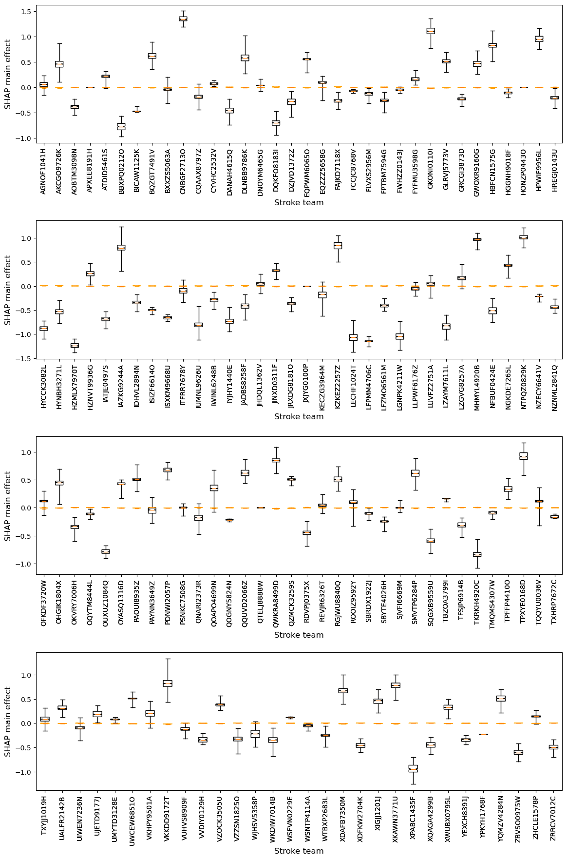
Boxplot (all hospitals together)#
Boxplot to analyse the range of SHAP main effect values for the one-hot encoded hospital features. Show as two populations: the attended hosptial, the sum of the hospitals not attended
fig = plt.figure(figsize=(8,5))
ax = fig.add_subplot(1,1,1)
ax.boxplot([shap_attended_hospital, shap_not_attend_these_hospitals],
            labels=["Attended hospital", "Not attend these hospitals"],
            whis=99999, notch=True);
title = ("The range of SHAP main effect values for the one-hot encoded "
         " hospital features\ndepending on whether attend the hospital, or not")
ax.set_title(title)
ax.set_xlabel("Instance population")
ax.set_ylabel("SHAP main effect");

# Add line at Shap = 0
ax.plot([plt.xlim()[0], plt.xlim()[1]], [0,0], c='0.8')

plt.savefig(f'./output/{notebook}_{model_text}'
            f'_hosp_shap_maineffect_attend_vs_notattend_boxplot.jpg', dpi=300,
            bbox_inches='tight', pad_inches=0.2)
plt.show()
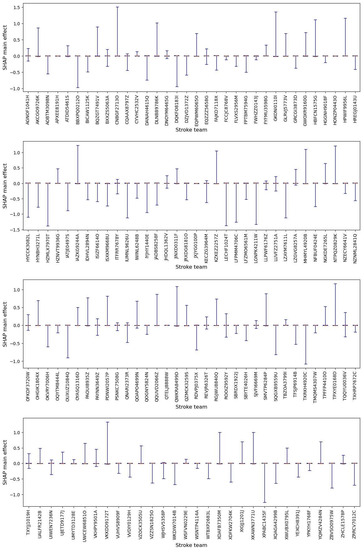
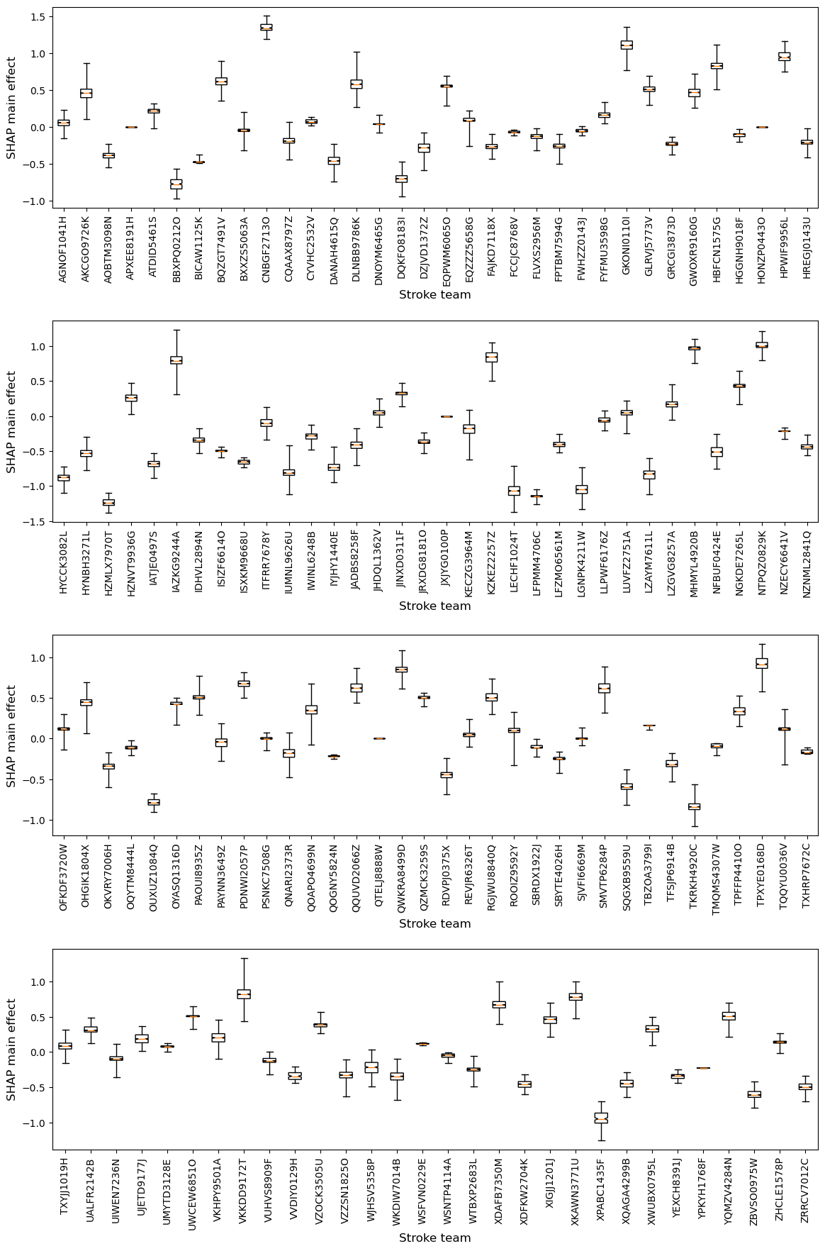
Boxplot (individual hospitals)#
Create a boxplot to show the range of SHAP values for each individual one-hot encoded hospital feature.
Show the SHAP value as two populations: 1) the group of instances that attend the hospital [black], and 2) the group of instances that do not attend the hosptial [orange].
Order the hospitals in descending order of mean SHAP value for the hospital the instance attended (so those that more often contribute to a yes-thrombolysis decision, through to those that most often contribute to a no-thrombolysis decision).
Firstly, to order the hospitals, create a dataframe containing the mean SHAP main effect value for each hosptial (for those instances that attended the hospital)
# Create list of SHAP main effect values (one per hospital) for those instances
#   that attend the hospital
attend_stroketeam_min = []
attend_stroketeam_q1 = []
attend_stroketeam_mean = []
attend_stroketeam_q3 = []
attend_stroketeam_max = []
for h in hospital_names:
    mask = df_hosp_shap_main_effects['Stroke team'] == h
    data_stroke_team = df_hosp_shap_main_effects[h][mask]
    q1, q3 = np.percentile(data_stroke_team, [25,75])
    attend_stroketeam_min.append(data_stroke_team.min())
    attend_stroketeam_q1.append(q1)
    attend_stroketeam_mean.append(data_stroke_team.mean())
    attend_stroketeam_q3.append(q3)
    attend_stroketeam_max.append(data_stroke_team.max())

# Create dataframe with six columns (hospital and descriptive stats)
df_hosp_shap_main_stats = pd.DataFrame(hospital_names, columns=["hospital"])
df_hosp_shap_main_stats["shap_min"] = attend_stroketeam_min
df_hosp_shap_main_stats["shap_q1"] = attend_stroketeam_q1
df_hosp_shap_main_stats["shap_mean"] = attend_stroketeam_mean
df_hosp_shap_main_stats["shap_q3"] = attend_stroketeam_q3
df_hosp_shap_main_stats["shap_max"] = attend_stroketeam_max

# sort in descending SHAP main effect value order
df_hosp_shap_main_stats.sort_values("shap_mean", ascending=False, inplace=True)
df_hosp_shap_main_stats.head(5)
| hospital | shap_min | shap_q1 | shap_mean | shap_q3 | shap_max | |
|---|---|---|---|---|---|---|
| 9 | CNBGF2713O | 1.195877 | 1.314107 | 1.351094 | 1.393786 | 1.508929 |
| 25 | GKONI0110I | 0.767646 | 1.057928 | 1.110841 | 1.168451 | 1.358355 |
| 65 | NTPQZ0829K | 0.797407 | 0.978037 | 1.006841 | 1.050939 | 1.206905 |
| 62 | MHMYL4920B | 0.753430 | 0.946048 | 0.964972 | 0.986911 | 1.103224 |
| 32 | HPWIF9956L | 0.750452 | 0.902049 | 0.956728 | 1.008806 | 1.169653 |
Add admission figures to xlabel in boxplot
Create dataframe with admissions and thrombolysis rate per stroke team (index)
# Get Stroke team name, the stroke team admission numbers, and list of SHAP
#   values for each instance that attended the stroke team
unique_stroketeams_list = list(set(X_combined["Stroke team"]))
admissions = [X[f'team_{s}'].sum() for s in unique_stroketeams_list]

df_stroketeam_ivt_adms = pd.DataFrame(unique_stroketeams_list,
                                      columns=["Stroke team"])
df_stroketeam_ivt_adms["Admissions"] = admissions
df_stroketeam_ivt_adms.set_index("Stroke team", inplace=True)
df_stroketeam_ivt_adms.sort_values("Admissions", ascending=True, inplace=True)

# Calculate IVT rate per hosptial
hosp_ivt_rate = data.groupby(by=["Stroke team"]).mean()["Thrombolysis"]

# Join IVT rate with admissions per hosptial
df_stroketeam_ivt_adms = df_stroketeam_ivt_adms.join(hosp_ivt_rate)

df_stroketeam_ivt_adms
| Admissions | Thrombolysis | |
|---|---|---|
| Stroke team | ||
| JXJYG0100P | 120 | 0.233333 |
| VVDIY0129H | 130 | 0.192308 |
| YEXCH8391J | 149 | 0.228188 |
| CNBGF2713O | 152 | 0.480263 |
| XPABC1435F | 166 | 0.216867 |
| ... | ... | ... |
| JINXD0311F | 1377 | 0.368192 |
| AKCGO9726K | 1428 | 0.369748 |
| OFKDF3720W | 1488 | 0.228495 |
| FPTBM7594G | 1645 | 0.321581 |
| FAJKD7118X | 1980 | 0.275758 |
132 rows × 2 columns
Create data for boxplot. Using order of hospitals from the df_hosp_shap_value_stats dataframe.
# Go through this order of hospitals
hospital_order = df_hosp_shap_main_stats["hospital"]

# Create list of SHAP main effect values (one per hospital) for instances that
#   attend stroke team
attend_stroketeam_groups_ordered = []
not_attend_stroketeam_groups_ordered = []

# Create list of labels for boxplot "stroke team name (admissions)"
xlabel = []

# Through hospital in defined order (as determined above)
for h in hospital_order:
    # Attend
    mask = df_hosp_shap_main_effects['Stroke team'] == h
    attend_stroketeam_groups_ordered.append(df_hosp_shap_main_effects[h][mask])
    # Not attend
    mask = df_hosp_shap_main_effects['Stroke team'] != h
    not_attend_stroketeam_groups_ordered.append(df_hosp_shap_main_effects[h][mask])
    # Label
    ivt_rate = int(df_stroketeam_ivt_adms['Thrombolysis'].loc[h] * 100)
    xlabel.append(f"{h} ({df_stroketeam_ivt_adms['Admissions'].loc[h]}, "
                  f"{ivt_rate}%)")
Plot the boxplot
Resource for using overall y min and max of both datasets on the 4 plots so have the same range: https://blog.finxter.com/how-to-find-the-minimum-of-a-list-of-lists-in-python/#:~:text=With%20the%20key%20argument%20of,of%20the%20list%20of%20lists
# Plot 34 hospitals on each figure to aid readability
print("Shows the range of contributions to the prediction from this hospital "
      "when patients 1) do [black], and 2) do not [orange] attend this "
      "hosptial")

# To group the hospitals into 34
st = 0
ed = 34
inc = ed
max_size = n_hospitals

# Use overall y min & max of both datasets on the 4 plots so have same range
ymin1 = min(min(attend_stroketeam_groups_ordered, key=min))
ymin2 = min(min(not_attend_stroketeam_groups_ordered, key=min))
ymax1 = max(max(attend_stroketeam_groups_ordered, key=max))
ymax2 = max(max(not_attend_stroketeam_groups_ordered, key=max))
ymin = min(ymin1, ymin2)
ymax = max(ymax1, ymax2)

# Adjust min and max to accommodate some wriggle room
yrange = ymax - ymin1
ymin = ymin - yrange/50
ymax = ymax + yrange/50

# Create figure with 4 subplots
fig = plt.figure(figsize=(12,25))

# Create four subplots
for subplot in range(4):
    ax = fig.add_subplot(4,1,subplot+1)

    # The contribution from this hospital when patients do not attend this
    #   hosptial
    c1 = "orange"
    c2 = "orange"
    c3 = "white"
    ax.boxplot(not_attend_stroketeam_groups_ordered[st:ed],
               labels=xlabel[st:ed],#df_hosp["hospital"][st:ed],
               whis=99999,patch_artist=True, notch=True,
               boxprops=dict(facecolor=c3, color=c1),
               capprops=dict(color=c1),
               whiskerprops=dict(color=c1),
               flierprops=dict(color=c1, markeredgecolor=c1),
               meanprops=dict(color=c2))

    # The contribution from this hospital when patients do attend this hosptial
    c1 = "black"
    c2 = "black"
    c3 = "white"
    ax.boxplot(attend_stroketeam_groups_ordered[st:ed],
               labels=xlabel[st:ed],#df_hosp["hospital"][st:ed],
               whis=99999,patch_artist=True, notch=True,
               boxprops=dict(facecolor=c3, color=c1),
               capprops=dict(color=c1),
               whiskerprops=dict(color=c1),
               flierprops=dict(color=c1, markeredgecolor=c1),
               meanprops=dict(color=c2))

    plt.ylabel('SHAP main effect (one-hot encoded hospital features)',size=12)
    plt.xlabel('Stroke team (admissions, IVT rate)',size=12)
    plt.ylim(ymin, ymax)
    plt.xticks(rotation=90)
    # Add line at Shap = 0
    ax.plot([plt.xlim()[0], plt.xlim()[1]], [0,0], c='0.8')
    st = min(st+inc,max_size)
    ed = min(ed+inc,max_size)

plt.subplots_adjust(bottom=0.25, wspace=0.05)
plt.tight_layout(pad=2)
plt.savefig(f'./output/{notebook}_{model_text}'
            f'_individual_hosp_shap_maineffect_attend_vs_notattend_boxplot.jpg',
            dpi=300, bbox_inches='tight', pad_inches=0.2)
plt.show()
Shows the range of contributions to the prediction from this hospital when patients 1) do [black], and 2) do not [orange] attend this hosptial
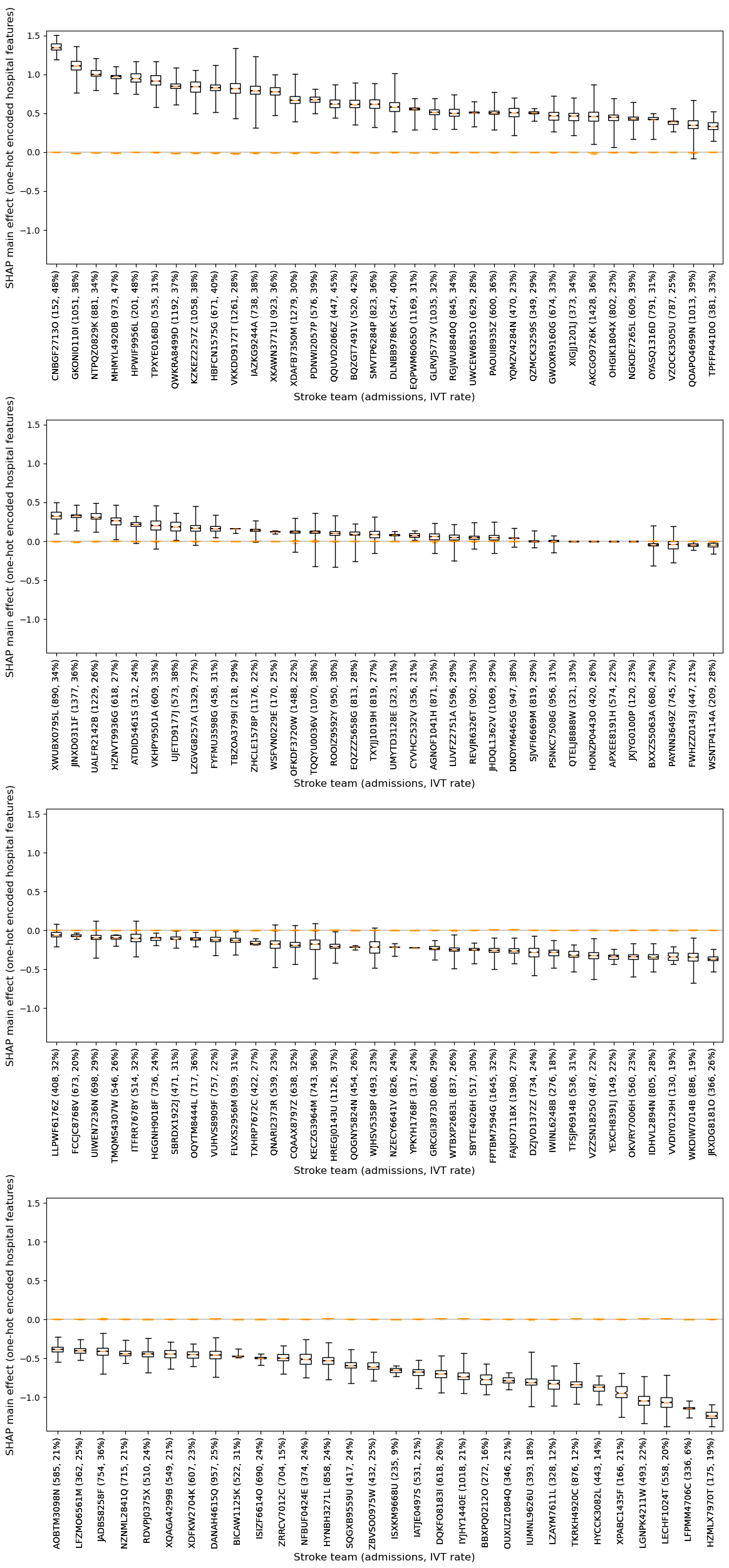
Notice that when patients do not attend the hospital the range of the SHAP values are largely centred on zero. When patients do attend hosptial, the range of SHAP values are largely one side of zero or the other (only a minority of hospitals have their interquartile range spanning zero).
iqr_below_zero = df_hosp_shap_main_stats["shap_q3"] < 0
iqr_spans_zero = (df_hosp_shap_main_stats["shap_q1"] *
                  df_hosp_shap_main_stats["shap_q3"])
iqr_above_zero = df_hosp_shap_main_stats["shap_q1"] > 0
iqr_is_zero1 = df_hosp_shap_main_stats["shap_q1"] == 0
iqr_is_zero2 = df_hosp_shap_main_stats["shap_q3"] == 0
iqr_is_zero = iqr_is_zero1 * iqr_is_zero2

print (f"There are {iqr_below_zero.sum()} hospitals whose interquartile range "
       f"is below zero")
print (f"There are {iqr_spans_zero.lt(0).sum()} hospitals whose interquartile "
       f"range spans zero")
print (f"There are {iqr_above_zero.sum()} hospitals whose interquartile range "
       f"is above zero")
print (f"There are {iqr_is_zero.sum()} hospitals whose interquartile range is "
       f"zero")
There are 68 hospitals whose interquartile range is below zero
There are 2 hospitals whose interquartile range spans zero
There are 58 hospitals whose interquartile range is above zero
There are 4 hospitals whose interquartile range is zero
How does the SHAP value for the one-hot encoded hospital features compare to the thrombolysis rate of the hospital?
Create dataframe containing the hospital’s IVT rate and SHAP value (for those patients that attend the hospital).
hosp_ivt_rate = data.groupby(by=["Stroke team"]).mean()["Thrombolysis"]
df_hosp_plot = df_hosp_shap_main_stats[["shap_mean","hospital"]].copy(deep=True)
df_hosp_plot.set_index("hospital", inplace=True)
df_hosp_plot = df_hosp_plot.join(hosp_ivt_rate)
df_hosp_plot
| shap_mean | Thrombolysis | |
|---|---|---|
| hospital | ||
| CNBGF2713O | 1.351094 | 0.480263 |
| GKONI0110I | 1.110841 | 0.389153 |
| NTPQZ0829K | 1.006841 | 0.349603 |
| MHMYL4920B | 0.964972 | 0.473792 |
| HPWIF9956L | 0.956728 | 0.487562 |
| ... | ... | ... |
| XPABC1435F | -0.941630 | 0.216867 |
| LGNPK4211W | -1.050424 | 0.227181 |
| LECHF1024T | -1.068985 | 0.204301 |
| LFPMM4706C | -1.148681 | 0.062500 |
| HZMLX7970T | -1.238915 | 0.194286 |
132 rows × 2 columns
Plot SHAP value for one-hot encoded hospital feature (mean for those instances that attend the hospital) vs hospital IVT rate
# Setup data for chart
x = df_hosp_plot['shap_mean']
y = df_hosp_plot['Thrombolysis']

# Fit a regression line to the points
slope, intercept, r_value, p_value, std_err = \
    stats.linregress(x, y)
r_square = r_value ** 2
y_pred = intercept + (x * slope)

# Create scatter plot with regression line
fig = plt.figure(figsize=(6,6))
ax = fig.add_subplot(1,1,1)
ax.scatter(x, y, color='black', marker='o', s=20)
ax.plot (x, y_pred, color = 'k', linestyle='--', linewidth=1)

# Add textbox
text = f'R squared: {r_square:.3f}'
ax.text(-1.2, 0.46, text,
         bbox=dict(facecolor='white', edgecolor='white'))

# Set chart limits
ax.set_ylim(0, 0.5)
ax.set_xlim(-1.5, 1.5)

# Chart titles
ax.set_xlabel("Attended hospital SHAP main effect\n"
              "(mean of the instances that attend the hospital)")
ax.set_ylabel('Thrombolysis rate')

plt.grid()

plt.savefig(f'./output/{notebook}_{model_text}'
            f'_attended_hosp_shap_maineffect_vs_ivt_rate.jpg', dpi=300,
            bbox_inches='tight', pad_inches=0.2)
plt.show()
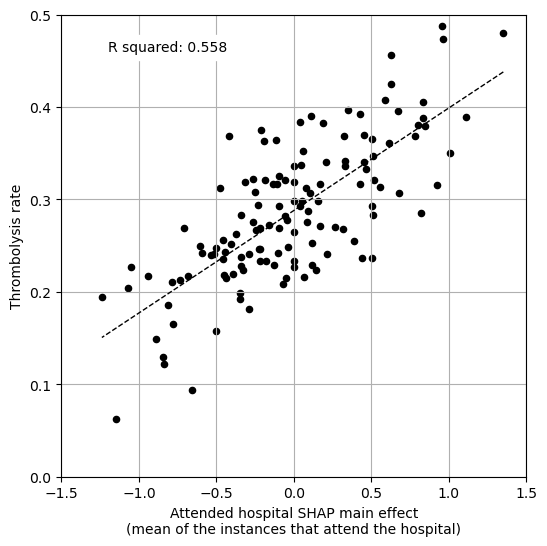
f = ('formula: ' + str("{:.2f}".format(slope)) + 'x + ' +
     str("{:.2f}".format(intercept)))
print (f'R squared: {r_square:.3f}\np: {p_value:0.4f}\nformula: {f}')
R squared: 0.558
p: 0.0000
formula: formula: 0.11x + 0.29
Extra code.#
There was a journey to analyse the data and arrive at the boxplot - that best visulaisation that we’ve yet found to summarise the data.
Below are the other ways we looked at the data, that led us to use the boxplot.
View descriptive stats
df_hosp_shap_main_effects.describe()
| AGNOF1041H | AKCGO9726K | AOBTM3098N | APXEE8191H | ATDID5461S | BBXPQ0212O | BICAW1125K | BQZGT7491V | BXXZS5063A | CNBGF2713O | ... | XWUBX0795L | YEXCH8391J | YPKYH1768F | YQMZV4284N | ZBVSO0975W | ZHCLE1578P | ZRRCV7012C | all_stroke_teams | attended_stroke_team | not_attended_stroke_teams | |
|---|---|---|---|---|---|---|---|---|---|---|---|---|---|---|---|---|---|---|---|---|---|
| count | 88792.000000 | 88792.000000 | 88792.000000 | 88792.0 | 88792.000000 | 88792.000000 | 88792.000000 | 88792.000000 | 88792.000000 | 88792.000000 | ... | 88792.000000 | 88792.000000 | 88792.000000 | 88792.000000 | 88792.000000 | 88792.000000 | 88792.000000 | 88792.000000 | 88792.000000 | 88792.000000 |
| mean | 0.002225 | -0.002223 | -0.000127 | 0.0 | -0.000024 | -0.000617 | -0.000036 | -0.000360 | -0.000835 | -0.000371 | ... | -0.001068 | -0.000195 | -0.000288 | 0.000739 | -0.000242 | 0.000136 | -0.000031 | -0.028864 | 0.052866 | -0.081730 |
| std | 0.007836 | 0.059602 | 0.032160 | 0.0 | 0.013083 | 0.043309 | 0.036543 | 0.048517 | 0.006011 | 0.056000 | ... | 0.034046 | 0.014031 | 0.013510 | 0.037285 | 0.042446 | 0.016898 | 0.044969 | 0.495006 | 0.490508 | 0.009425 |
| min | -0.157127 | -0.023108 | -0.545685 | 0.0 | -0.020577 | -0.970844 | -0.491139 | -0.006188 | -0.316738 | -0.003435 | ... | -0.007775 | -0.438120 | -0.227064 | -0.003009 | -0.793056 | -0.012036 | -0.701417 | -1.473849 | -1.377437 | -0.125886 |
| 25% | 0.001234 | -0.010979 | 0.002300 | 0.0 | -0.000886 | 0.001620 | 0.002762 | -0.004346 | -0.000565 | -0.002788 | ... | -0.005008 | 0.000341 | 0.000520 | -0.002125 | 0.002485 | -0.001968 | 0.003631 | -0.356805 | -0.269488 | -0.087785 |
| 50% | 0.001643 | -0.009767 | 0.002432 | 0.0 | -0.000788 | 0.001760 | 0.002771 | -0.003988 | -0.000475 | -0.002681 | ... | -0.004354 | 0.000361 | 0.000522 | -0.001959 | 0.002721 | -0.001776 | 0.003967 | -0.064828 | 0.019044 | -0.082054 |
| 75% | 0.002085 | -0.008317 | 0.002622 | 0.0 | -0.000739 | 0.001912 | 0.002830 | -0.003657 | -0.000370 | -0.002606 | ... | -0.003839 | 0.000423 | 0.000522 | -0.001785 | 0.002917 | -0.001618 | 0.004273 | 0.343368 | 0.421969 | -0.075944 |
| max | 0.233301 | 0.869452 | 0.003943 | 0.0 | 0.322364 | 0.002517 | 0.002991 | 0.892236 | 0.200258 | 1.508929 | ... | 0.501102 | 0.000591 | 0.000574 | 0.703816 | 0.003915 | 0.268413 | 0.006143 | 1.434067 | 1.508929 | -0.019046 |
8 rows × 135 columns
Are there any hospitals that only have one value for all instances? This indicates that the feature was not used to divide a node in any of the trees.
print("These hospitals have the same SHAP value for all patients")
for h in hospital_names:
    if df_hosp_shap_main_effects[h].nunique() == 1:
        print(f"{h} has SHAP value {df_hosp_shap_main_effects[h].unique()[0]} "
              f"for all instances")
These hospitals have the same SHAP value for all patients
APXEE8191H has SHAP value 0.0 for all instances
HONZP0443O has SHAP value 0.0 for all instances
JXJYG0100P has SHAP value 0.0 for all instances
QTELJ8888W has SHAP value 0.0 for all instances
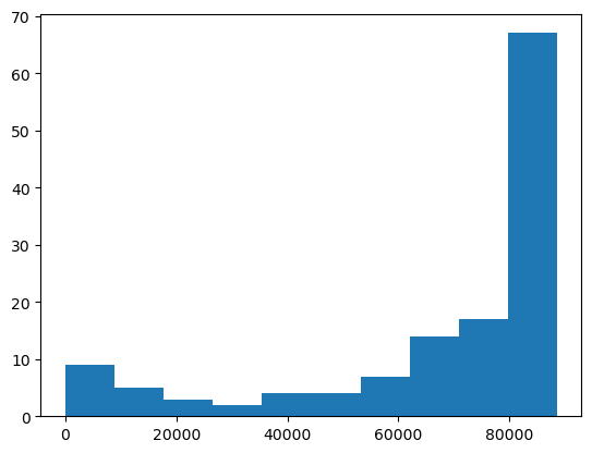
What’s the range of number of unique values for each hospital for all patients?
print ("The count of unique SHAP main effect values for each hospital")
n_unique_per_hosptial = [
            df_hosp_shap_main_effects[h].nunique() for h in hospital_names]
fig, axes = plt.subplots(1)
axes.hist(n_unique_per_hosptial);
The count of unique SHAP main effect values for each hospital
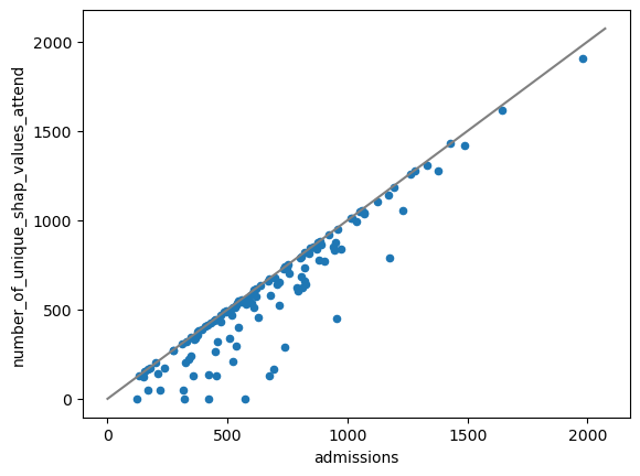
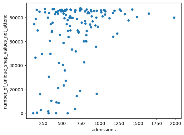
Is there a relationship between number of unique SHAP main effect values, and hospital admission numnbers?
# Calculate the number of admissions per hospital
admissions = [X[h].sum() for h in hospital_names_ohe]

# Calculate number of unique SHAP values
n_unique_per_hosptial_all_instances = [
                df_hosp_shap_main_effects[h].nunique() for h in hospital_names]

# Calculate number of unique SHAP values for patients that attend
n_unique_per_hosptial_attend = []
n_unique_per_hosptial_not_attend = []
for h in hospital_names:
    mask = df_hosp_shap_main_effects["Stroke team"] == h
    n_unique_per_hosptial_attend.append(
                                df_hosp_shap_main_effects[h][mask].nunique())
    mask = np.logical_not(mask)
    n_unique_per_hosptial_not_attend.append(
                                df_hosp_shap_main_effects[h][mask].nunique())

# Store in dataframe
df_hospital_details = pd.DataFrame(admissions, columns=["admissions"])
df_hospital_details["number_of_unique_shap_values"] = (
                                            n_unique_per_hosptial_all_instances)
df_hospital_details["number_of_unique_shap_values_attend"] = (
                                            n_unique_per_hosptial_attend)
df_hospital_details["number_of_unique_shap_values_not_attend"] = (
                                            n_unique_per_hosptial_not_attend)

df_hospital_details["Stroke team"] = hospital_names
# Plot 1: Admissions vs number of unique SHAP values
#   All instances contributing to SHAP value count
df_hospital_details.plot.scatter(x="admissions",
                                 y="number_of_unique_shap_values")

# Plot 2: Admissions vs number of unique SHAP values
#   Only instances that attend hosptial contributing to SHAP value count
ax = df_hospital_details.plot.scatter(x="admissions",
                                      y="number_of_unique_shap_values_attend")
# Include x = y line (shows the max number of of unique values)
max_axis_value = max(ax.get_xlim()[1], ax.get_ylim()[1])
ax.plot([0, max_axis_value], [0, max_axis_value], c='0.5')

# Plot 3: Admissions vs number of unique SHAP values
#   Only instances that do not attend hosptial contributing to SHAP value count
df_hospital_details.plot.scatter(x="admissions",
                                 y="number_of_unique_shap_values_not_attend")
<AxesSubplot:xlabel='admissions', ylabel='number_of_unique_shap_values_not_attend'>
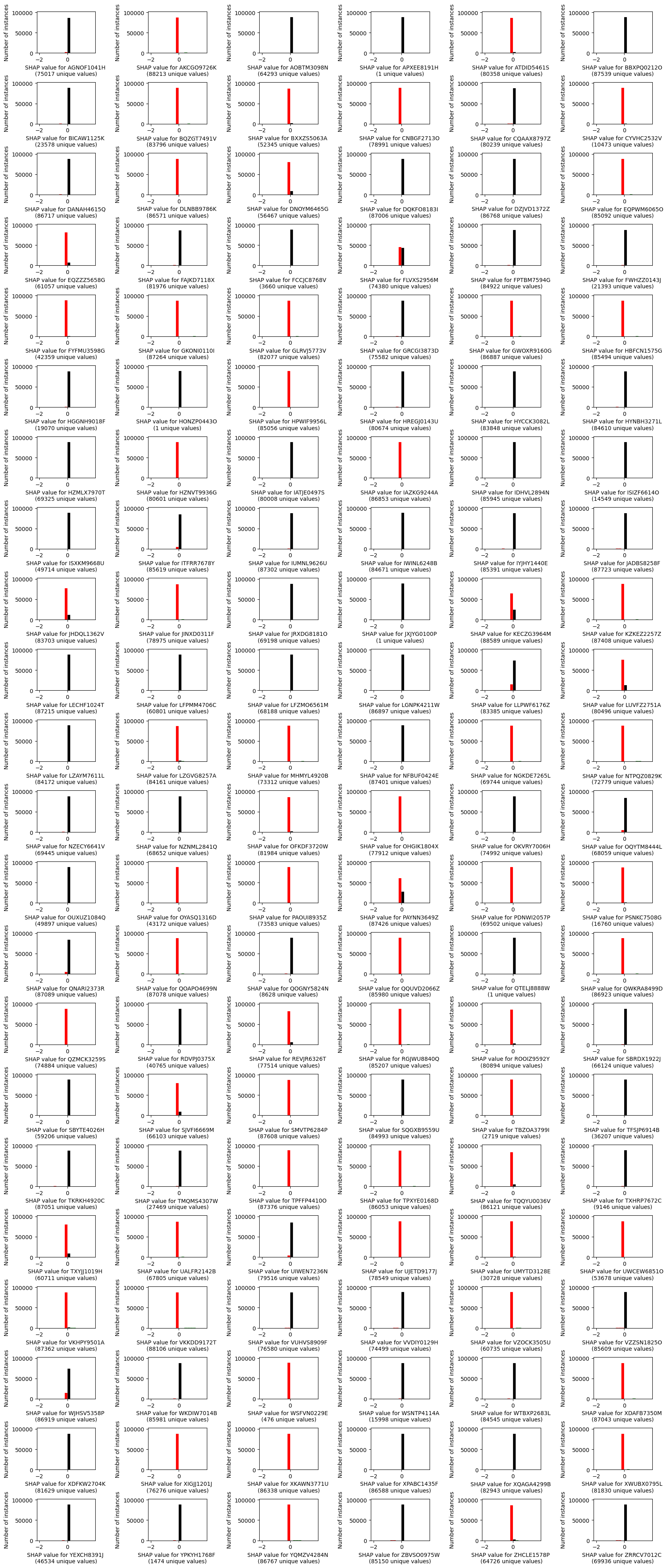
Let’s look at a hospital with the most unique values
row_index = df_hospital_details["number_of_unique_shap_values"].idxmax()
stroke_team_max_n_unique = df_hospital_details["Stroke team"].iloc[row_index]
print(f"Hospital {stroke_team_max_n_unique} has "
      f"{df_hospital_details['number_of_unique_shap_values'].max()} "
      f"unique values")
Hospital KECZG3964M has 88589 unique values
Look at descriptive stats for this hospital
df_hosp_shap_main_effects[stroke_team_max_n_unique].describe()
count    88792.000000
mean        -0.002000
std          0.019761
min         -0.620963
25%         -0.000957
50%         -0.000507
75%          0.000070
max          0.086910
Name: KECZG3964M, dtype: float64
What’s the difference between the SHAP main effect value for this hospital for the instances that attended it, compared to those instances that didn’t?
Colour histogram bars to represent: Green for positive SHAP value, Grey for 0, and Red for negative SHAP value.
def create_histogram_with_colours(data, bins, ax):

    """
    data [DataFrame]: Single column of data containing values in the histogram
    bins [int]: Width of each histogram bar
    ax [object]: Matplotlib axes object

    Histogram bars are:
        green if positive value
        black if spans zero
        red if negative value

    Function return matplotlib axes object
    """

    N, bins, patches = ax.hist(data, edgecolor='white', linewidth=0.2,
                               bins=bins);

    for i in range(N.shape[0]):
        if bins[i] < 0 and bins[i+1] < 0:
                patches[i].set_facecolor('red')
        elif bins[i] > 0 and bins[i+1] > 0:
                patches[i].set_facecolor('green')
        else:
            patches[i].set_facecolor('black')

    return(ax)
stroke_team = stroke_team_max_n_unique

mask1 = df_hosp_shap_main_effects["Stroke team"] == stroke_team
shap_values_attend = df_hosp_shap_main_effects[stroke_team][mask1]

mask2 = np.logical_not(mask1)
shap_values_not_attend = df_hosp_shap_main_effects[stroke_team][mask2]

# Plot histogram of SHAP main effect values for all instances
fig, ax = plt.subplots()
create_histogram_with_colours(df_hosp_shap_main_effects[stroke_team], 100, ax)
ax.set_xlabel(f"SHAP")
ax.set_ylabel("Number of instances")
print(f"{stroke_team}. Number of unique values for all patients (attended or "
      f"not): {df_hosp_shap_main_effects[stroke_team].nunique()}")
print(f"Number of patients {df_hosp_shap_main_effects[stroke_team].shape[0]}")
plt.show

# Plot histogram of SHAP main effect values for instances attend hospital
mask1 = mask1 * 1
s1 = mask1.sum()
fig, ax = plt.subplots()
ax = create_histogram_with_colours(shap_values_attend, 100, ax)
ax.set_xlabel(f"SHAP")
ax.set_ylabel("Number of instances")
print(f"{stroke_team}. Number of unique values for those patients who "
      f"attended: {shap_values_attend.nunique()}")
print(f"Number of patients {s1}")
plt.show

# Plot histogram of SHAP main effect values for instances not attend hospital
mask2 = mask2 * 1
s2 = mask2.sum()
fig, ax = plt.subplots()
ax = create_histogram_with_colours(shap_values_not_attend, 100, ax)
ax.set_xlabel(f"SHAP")
ax.set_ylabel("Number of instances")
print(f"{stroke_team}. Number of unique values for those patients who do not "
      f"attended: {shap_values_not_attend.nunique()}")
print(f"Number of patients {s2}")
plt.show
KECZG3964M. Number of unique values for all patients (attended or not): 88589
Number of patients 88792
KECZG3964M. Number of unique values for those patients who attended: 740
Number of patients 743
KECZG3964M. Number of unique values for those patients who do not attended: 87849
Number of patients 88049
<function matplotlib.pyplot.show(close=None, block=None)>
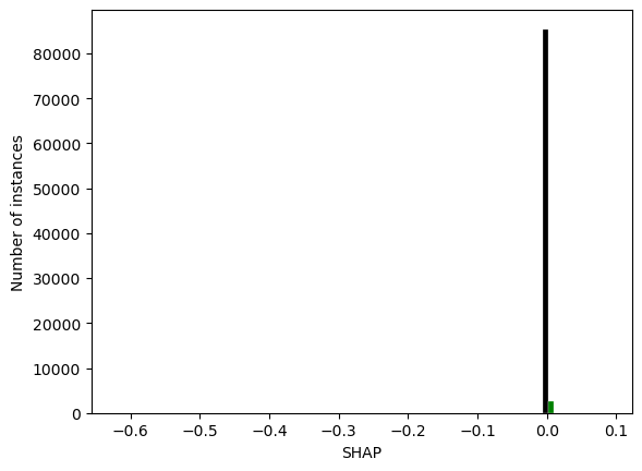
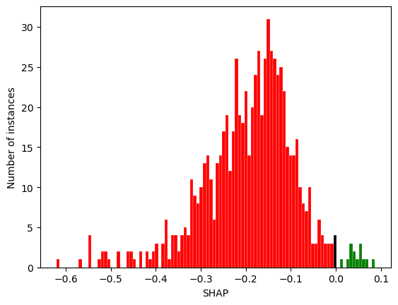
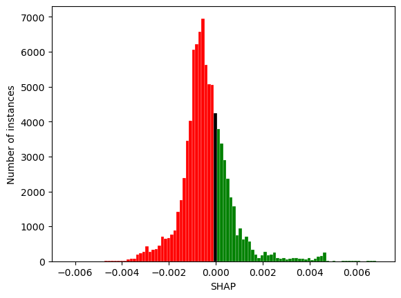
So there’s two populations, but in the top plot you can not see the histogram for the instances that attended the hospital, as their frequency is too few and the plot is dominated by the frequency range for the number of patients who did not attend the hosptial.
Those that attend have a higher SHAP value, but there’s fewer instances so can not see these values. Those that do not attend have a low SHAP value, a smaller range of values, but far more instances, so dominates the y axis, but can not see the spread (as the other population has determines the x axis range).
Better to view as two populations.
Plot a boxplot for the SHAP values of each hospital (for all instances)
# Create list of values for each boxplot (one per hospital)
stroketeam_groups = []
for h in hospital_names:
    stroketeam_groups.append(df_hosp_shap_main_effects[h])
# Create a figure with 35 hospitals in each to aid visually
print("Shows the range of contributions to the prediction from this hospital "
      "for all the instances")

# To group the hospitals into 34
st = 0
ed = 34
inc = ed
max_size = n_hospitals

# Plot properties
c1 = "navy"
c2 = "navy"
c3 = "white"

# Create figure with 4 subplots
fig = plt.figure(figsize=(12,18))

# Create four subplots
for subplot in range(4):
    ax = fig.add_subplot(4,1,subplot+1)

    plt.boxplot(stroketeam_groups[st:ed],
                labels=df_hosp_shap_main_effects.columns[st:ed],
                whis=9999999, patch_artist=True, notch=True,
                boxprops=dict(facecolor=c3, color=c1),
                capprops=dict(color=c1),
                whiskerprops=dict(color=c1),
                flierprops=dict(color=c1, markeredgecolor=c1),
                meanprops=dict(color=c2))
    plt.ylabel('SHAP main effect',size=12)
    plt.xlabel('Stroke team',size=12)
    plt.xticks(rotation=90)
    st = min(st+inc,max_size)
    ed = min(ed+inc,max_size)

plt.subplots_adjust(bottom=0.25, wspace=0.05)
plt.tight_layout(pad=2)
plt.show()
Shows the range of contributions to the prediction from this hospital for all the instances
Shows that hospitals have the majority of their cases at value 0. Some hospitals have a wider range of SHAP main effect values than others, with most having their range entirely on one side of 0 or the other.
Let’s plot it again, twice, showing only those instances that go to the hospital, and again when they do not.
Include instances that attend the hospital only
# Create list of values for each boxplot (one per hospital), only include SHAP
#   value for instances that attend stroke team
attend_stroketeam_groups = []
for h in hospital_names:
    mask = df_hosp_shap_main_effects['Stroke team'] == h
    attend_stroketeam_groups.append(df_hosp_shap_main_effects[h][mask])
# Create a figure with 35 hospitals in each to aid visually
print("Shows the range of contributions to the prediction from this hospital "
      "when patients attend this hosptial")

# To group the hospitals into 34
st = 0
ed = 34
inc = ed
max_size = n_hospitals

# Plot properties
c1 = "black"
c2 = "black"
c3 = "white"

# Create figure with 4 subplots
fig = plt.figure(figsize=(12,18))

# Create four subplots
for subplot in range(4):
    ax = fig.add_subplot(4,1,subplot+1)

    plt.boxplot(attend_stroketeam_groups[st:ed],
                labels=df_hosp_shap_main_effects.columns[st:ed],
                whis=999999,patch_artist=True, notch=True,
                boxprops=dict(facecolor=c3, color=c1),
                capprops=dict(color=c1),
                whiskerprops=dict(color=c1),
                flierprops=dict(color=c1, markeredgecolor=c1),
                meanprops=dict(color=c2))

    plt.ylabel('SHAP main effect',size=12)
    plt.xlabel('Stroke team',size=12)
    plt.xticks(rotation=90)
    st = min(st+inc,max_size)
    ed = min(ed+inc,max_size)

plt.subplots_adjust(bottom=0.25, wspace=0.05)
plt.tight_layout(pad=2)
plt.show()
Shows the range of contributions to the prediction from this hospital when patients attend this hosptial
Edit data so only contains instances when not go to hospital
# Only include SHAP value for instances that do not attend stroke team
not_attend_stroketeam_groups = []
for h in hospital_names:
    mask = df_hosp_shap_main_effects['Stroke team'] != h
    not_attend_stroketeam_groups.append(df_hosp_shap_main_effects[h][mask])
# Create a figure with 35 hospitals in each to aid visually
print("Shows the range of contributions to the prediction from this hospital "
      "when patients do not attend this hosptial")

# To group the hospitals into 34
st = 0
ed = 34
inc = ed
max_size = n_hospitals

# Plot properties
c1 = "orange"
c2 = "orange"
c3 = "white"

# Create figure with 4 subplots
fig = plt.figure(figsize=(12,18))

# Create four subplots
for subplot in range(4):
    ax = fig.add_subplot(4,1,subplot+1)

    plt.boxplot(not_attend_stroketeam_groups[st:ed],
                labels=df_hosp_shap_main_effects.columns[st:ed],
                whis=999999,patch_artist=True, notch=True,
                boxprops=dict(facecolor=c3, color=c1),
                capprops=dict(color=c1),
                whiskerprops=dict(color=c1),
                flierprops=dict(color=c1, markeredgecolor=c1),
                meanprops=dict(color=c2))

    plt.ylabel('Shap main effect', size=12)
    plt.xlabel('Stroke team', size=12)
    plt.xticks(rotation=90)
    st = min(st+inc,max_size)
    ed = min(ed+inc,max_size)

plt.subplots_adjust(bottom=0.25, wspace=0.05)
plt.tight_layout(pad=2)
plt.show()
Shows the range of contributions to the prediction from this hospital when patients do not attend this hosptial
# Two box plots on 1 plot (spread of SHAP when instance attend, and not
#   attend, hospital)

# Create a figure with 35 hospitals in each to aid visually
print("Shows the range of contributions to the prediction from this hospital "
      "when patients 1) do [black], and 2) do not [orange] attend this "
      "hosptial")

# To group the hospitals into 34
st = 0
ed = 34
inc = ed
max_size = n_hospitals

# Create figure with 4 subplots
fig = plt.figure(figsize=(12,18))

# Create four subplots
for subplot in range(4):
    ax = fig.add_subplot(4,1,subplot+1)

    # The contribution from this hospital when patients do not attend this
    #   hospital
    c1 = "orange"
    c2 = "orange"
    c3 = "white"
    plt.boxplot(not_attend_stroketeam_groups[st:ed],
                labels=df_hosp_shap_main_effects.columns[st:ed],
                whis=99999,patch_artist=True, notch=True,
                boxprops=dict(facecolor=c3, color=c1),
                capprops=dict(color=c1),
                whiskerprops=dict(color=c1),
                flierprops=dict(color=c1, markeredgecolor=c1),
                meanprops=dict(color=c2))

    # The contribution from this hospital when patients do attend this hospital
    c1 = "black"
    c2 = "black"
    c3 = "white"
    plt.boxplot(attend_stroketeam_groups[st:ed],
                labels=df_hosp_shap_main_effects.columns[st:ed],
                whis=99999,patch_artist=True, notch=True,
                boxprops=dict(facecolor=c3, color=c1),
                capprops=dict(color=c1),
                whiskerprops=dict(color=c1),
                flierprops=dict(color=c1, markeredgecolor=c1),
                meanprops=dict(color=c2))

    plt.ylabel('SHAP main effect',size=12)
    plt.xlabel('Stroke team',size=12)
    plt.xticks(rotation=90)
    st = min(st+inc,max_size)
    ed = min(ed+inc,max_size)

plt.subplots_adjust(bottom=0.25, wspace=0.05)
plt.tight_layout(pad=2)
plt.show()
Shows the range of contributions to the prediction from this hospital when patients 1) do [black], and 2) do not [orange] attend this hosptial
Does it help understanding to represent this as histograms?
Create three matrix of histograms.
One with all the instances to each hosptial
One with just the instances that attend each hosptial
One with just the instances that don’t attend each hosptial.
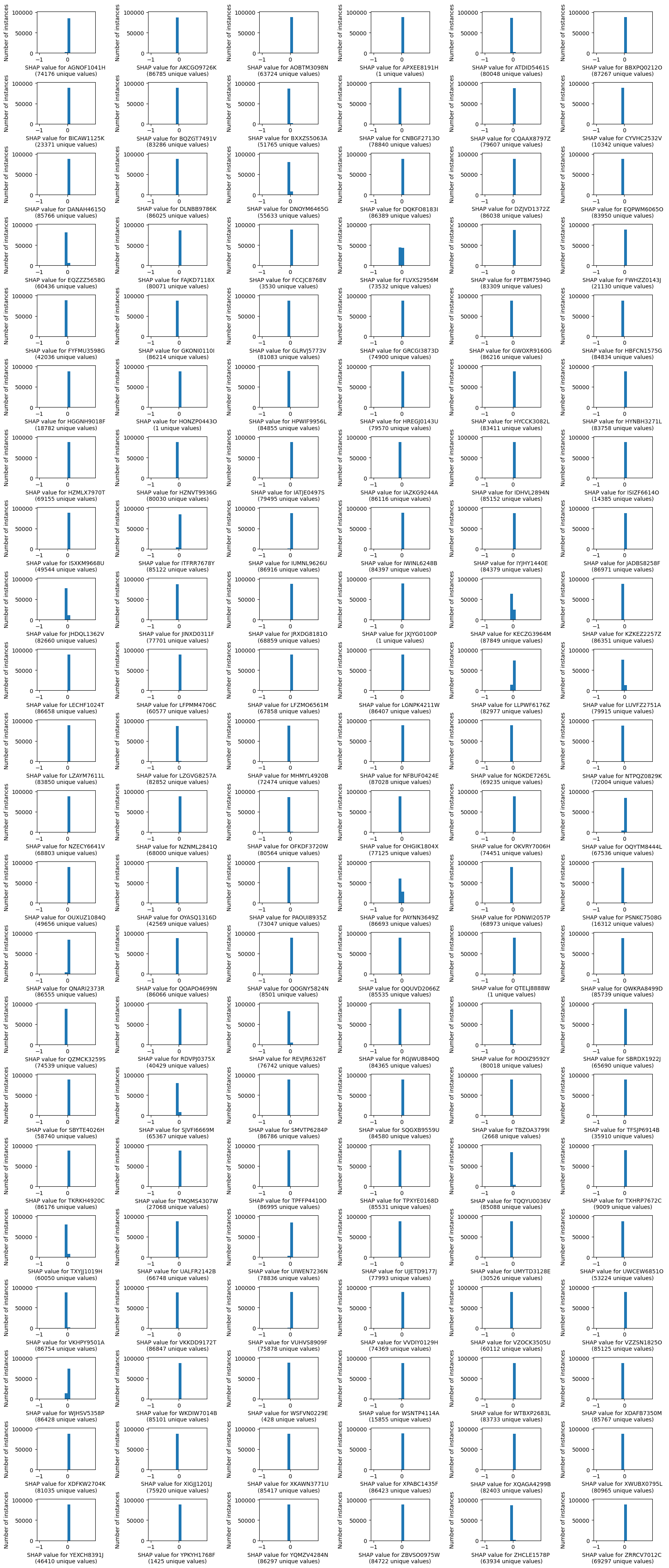
One with all the instances to each hosptial (forcing same axis ranges)
# Find the largest value used for the y axis in all of the histograms in the
#   subplots (use this to set the max for each subplot)
y_max = -1
x_min = 99
x_max = -99
fig, axes = plt.subplots(1)
for h in hospital_names:
    # Plot histogram
    axes.hist(df_hosp_shap_main_effects[h])
    # Get axis limits
    ylims = axes.get_ylim()
    # Store if greater than found so far
    y_max = max(y_max, ylims[1])
    # Get axis limits
    xlims = axes.get_xlim()
    # Store if greater than found so far
    x_min = min(x_min, xlims[0])
    x_max = max(x_max, xlims[1])
# Don't display plot
plt.close(fig)

# Define width of histogram bins based on the x axis range
bin_width = (abs(math.floor(xlims[0])) + abs(math.ceil(xlims[1])))/20

# Setup figure with subplots
fig, axes = plt.subplots(
    nrows=22,
    ncols=6)
axes = axes.ravel()

count = 0
for h in hospital_names:
    n_unique = df_hosp_shap_main_effects[h].nunique()
    ax=axes[count]
    create_histogram_with_colours(df_hosp_shap_main_effects[h],
            np.arange(math.floor(xlims[0]),math.ceil(xlims[1]),bin_width),
            ax)
    ax.set_xlabel(f"SHAP value for {h} \n({n_unique} unique values)")
    ax.set_ylabel("Number of instances")
    ax.set_ylim(0, (y_max*1.1))
    count += 1

# Define figure display
fig.set_figheight(50)
fig.set_figwidth(20)
#plt.tight_layout(pad=2)
fig.subplots_adjust(hspace=0.7, wspace=0.9)
plt.show()
One with just the instances that attend each hosptial
# Setup figure with subplots
fig, axes = plt.subplots(
    nrows=22,
    ncols=6)
axes = axes.ravel()

count = 0
for h in hospital_names:
    # mask data for those that attend hospital
    mask = X_combined["Stroke team"] == h
    shap_values_not_attend = df_hosp_shap_main_effects[h][mask]
    n_unique = shap_values_not_attend.nunique()
    ax=axes[count]
    create_histogram_with_colours(shap_values_not_attend, 20, ax)
    ax.set_xlabel(f"SHAP value for {h} \n({n_unique} unique values)")
    ax.set_ylabel("Number of instances \n(not attend hosptial)")
    count += 1

fig.set_figheight(50)
fig.set_figwidth(20)
fig.subplots_adjust(hspace=0.7, wspace=0.9)
plt.show()
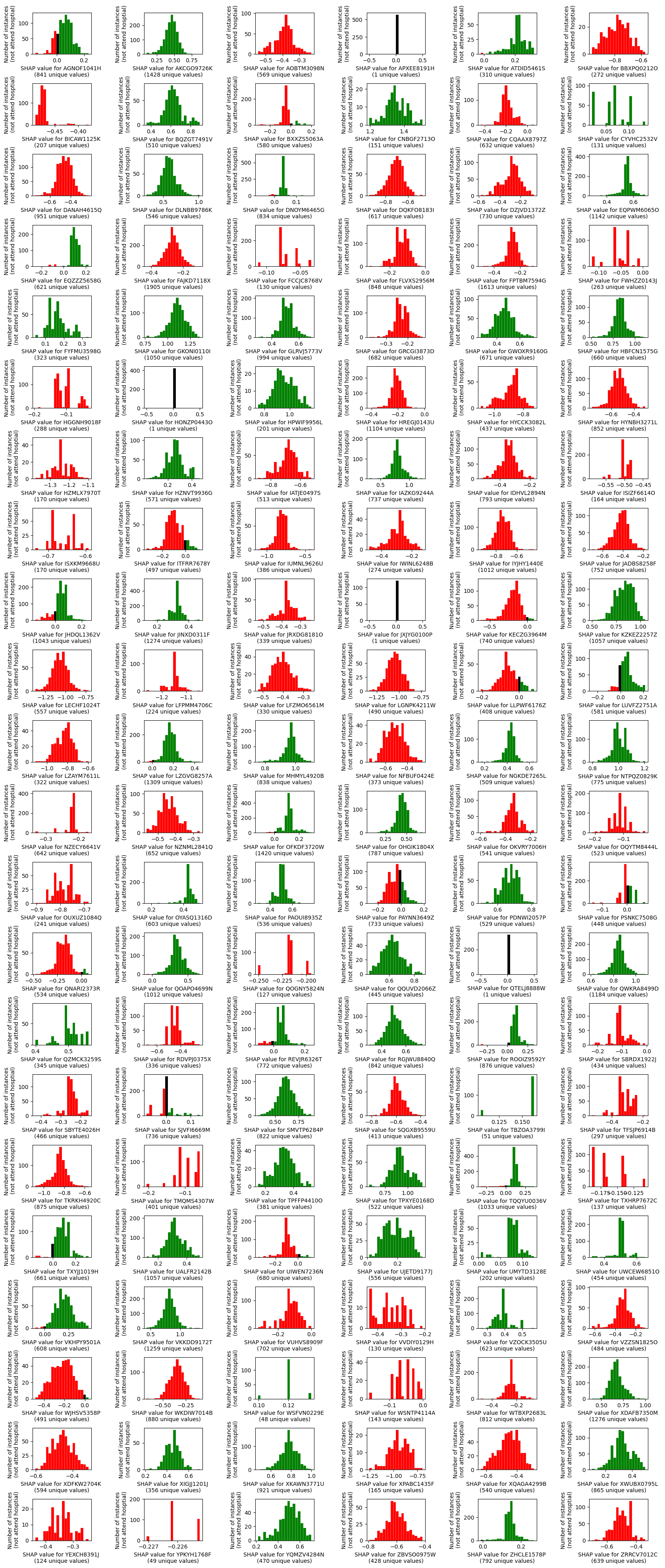
One with just the instances that don’t attend each hosptial.
# Setup figure with subplots
fig, axes = plt.subplots(
    nrows=22,
    ncols=6)
axes = axes.ravel()

count = 0
for h in hospital_names:
    mask = X_combined["Stroke team"] == h
    # Those that didn't attend hospital
    mask = np.logical_not(mask)
    shap_values_not_attend = df_hosp_shap_main_effects[h][mask]
    n_unique = shap_values_not_attend.nunique()
    ax=axes[count]
    create_histogram_with_colours(shap_values_not_attend, 20, ax)
    ax.set_xlabel(f"SHAP value for {h} \n({n_unique} unique values)")
    ax.set_ylabel("Number of instances \n(not attend hosptial)")
    count += 1

fig.set_figheight(50)
fig.set_figwidth(20)
fig.subplots_adjust(hspace=0.7, wspace=0.9)
plt.show()
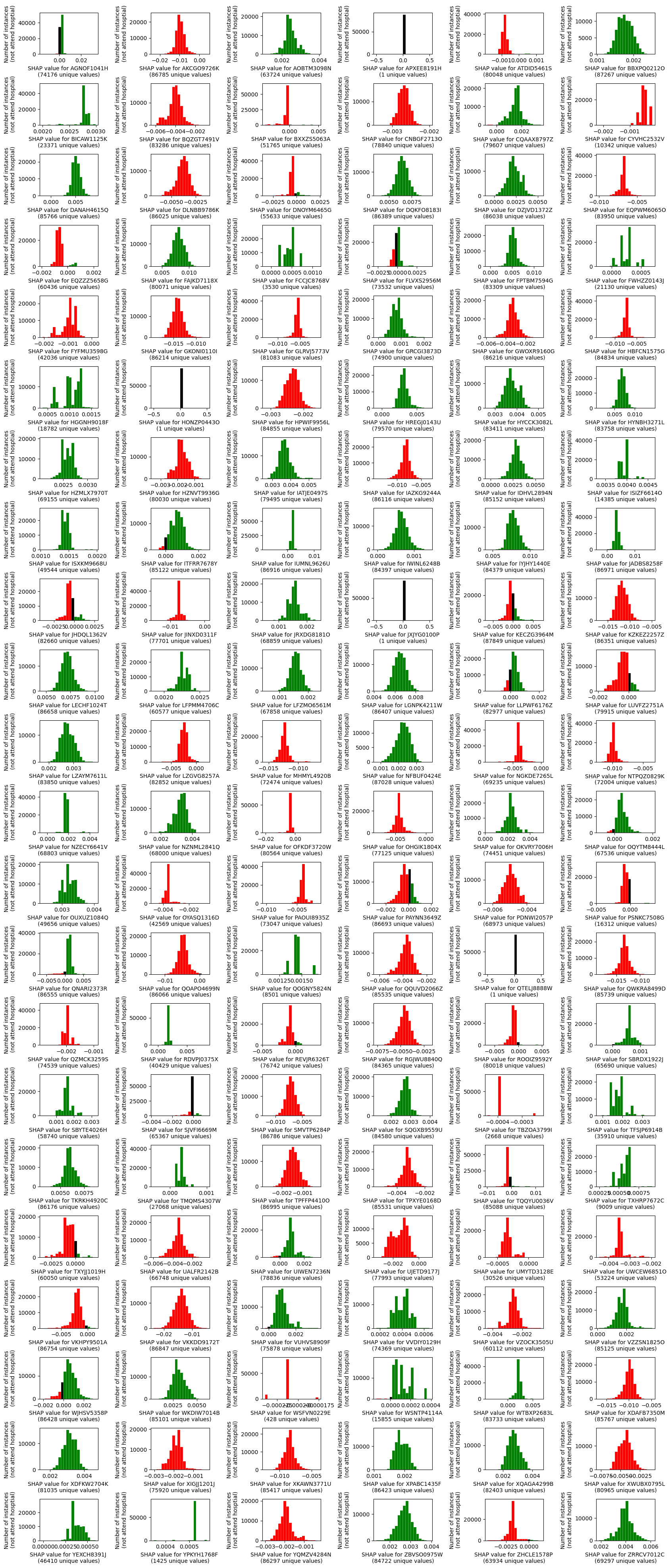
Code showing the same histograms, with each having the same x axis range and y axis range
# Find the largest value used for the y axis in all of the histograms in the
#   subplots (use this to set the max for each subplot)
y_max = -1
x_min = 99
x_max = -99
fig, axes = plt.subplots(1)
for h in hospital_names:
    # mask data for those that attend hospital
    mask = df_hosp_shap_main_effects["Stroke team"] == h
    # Those that didn't attend
    mask = np.logical_not(mask)
    shap_values_attend = df_hosp_shap_main_effects[h][mask]
    n_unique = shap_values_attend.nunique()
    # Plot histogram
    axes.hist(shap_values_attend)
    # Get axis limits
    ylims = axes.get_ylim()
    # Store if greater than found so far
    y_max = max(y_max, ylims[1])
    # Get axis limits
    xlims = axes.get_xlim()
    # Store if greater than found so far
    x_min = min(x_min, xlims[0])
    x_max = max(x_max, xlims[1])
# Don't display plot
plt.close(fig)

# Define width of histogram bins based on the x axis range
bin_width = (abs(math.floor(xlims[0])) + abs(math.ceil(xlims[1])))/20

# Setup figure with subplots
fig, axes = plt.subplots(
    nrows=22,
    ncols=6)
axes = axes.ravel()

count = 0
for h in hospital_names:
    # mask data for those that attend hospital
    mask = df_hosp_shap_main_effects["Stroke team"] == h
    # Those that didn't attend
    mask = np.logical_not(mask)
    shap_values_attend = df_hosp_shap_main_effects[h][mask]
    n_unique = shap_values_attend.nunique()
    # Plot histogram
    ax=axes[count]
    ax.hist(shap_values_attend,
            bins=np.arange(math.floor(xlims[0]),math.ceil(xlims[1]),bin_width))
    ax.set_xlabel(f"SHAP value for {h} \n({n_unique} unique values)")
    ax.set_ylabel("Number of instances")
    ax.set_ylim(0, (y_max*1.1))
    count += 1

# Define figure display
fig.set_figheight(50)
fig.set_figwidth(20)
fig.subplots_adjust(hspace=0.7, wspace=0.9)
plt.show()