Summary and outline
Contents
Summary and outline#
Part of the NIHR SAMueL (Stroke Audit Machine Learning) project.
Background#
Stroke is a common cause of adult disability. Most strokes (about four out of five) are caused by a blood clot in the brain, and have the potential to be treated with clot-busting drugs to break up the blood clot that is causing their stroke - this is called thrombolysis. Thrombolysis improves stroke outcomes overall, with more people being able to carry out their normal daily activities. There is, however, a small risk of a bleed in the brain, which is fatal in about 1 in 50 patients receiving thrombolysis, with the risk bing highest in those with the most severe strokes. Overall, thrombolysis does not increase risk of death, as the risk of death from a bleed is balanced out by the benefits of thrombolysis to others. Clinicians, patients, and carers, must however consider both benefits and risks of thrombolysis when deciding on whether to use it.
Expert opinion is that about one in five patients should receive thrombolysis, and this is the target set in the NHS long term plan. At the moment only about one in nine patients actually receive this treatment in the UK. There is a lot of variation between hospitals, which means that the same patient might receive different treatment depending on which hospital they attend (figure 5).
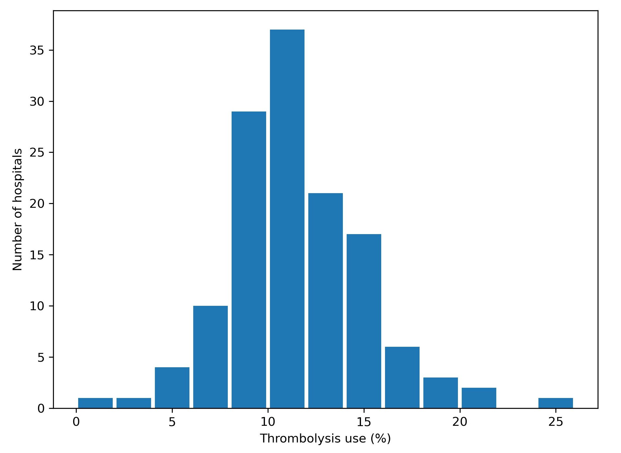
Fig. 5 Variation in thrombolysis use across hospitals in England and Wales 2016-2018.#
In a previous project, SAMueL-1, we trained machine-learning models to predict whether any individual patient would receive thrombolysis in any hospital. This allowed us to investigate what differences in treatment are likely to be due to differences between patients, and what differences in treatment were likely to be due to differences between hospitals.
Aims of this study#
The aims of this study were 1) to apply explainable machine learning techniques to investigate the most significant features that drive decisions to use thrombolysis at different hospitals, and 2) to model and explain what are the the features that are most important in hospitals that we predict would make different decisions about any given patient.
What is Explainable Machine Learning?#
Machine learning models generally learn from large sets of data - learning patterns between aspects of the data and some outcome of interest. In this case the data contains a range of features about the patient, such as their age, sex, a breakdown of their stroke symptoms, etc. The machine learning model learns the relationship between those features and whether the patient receives thrombolysis or not.
A general diagram of our machine learning is shown in Figure 6.
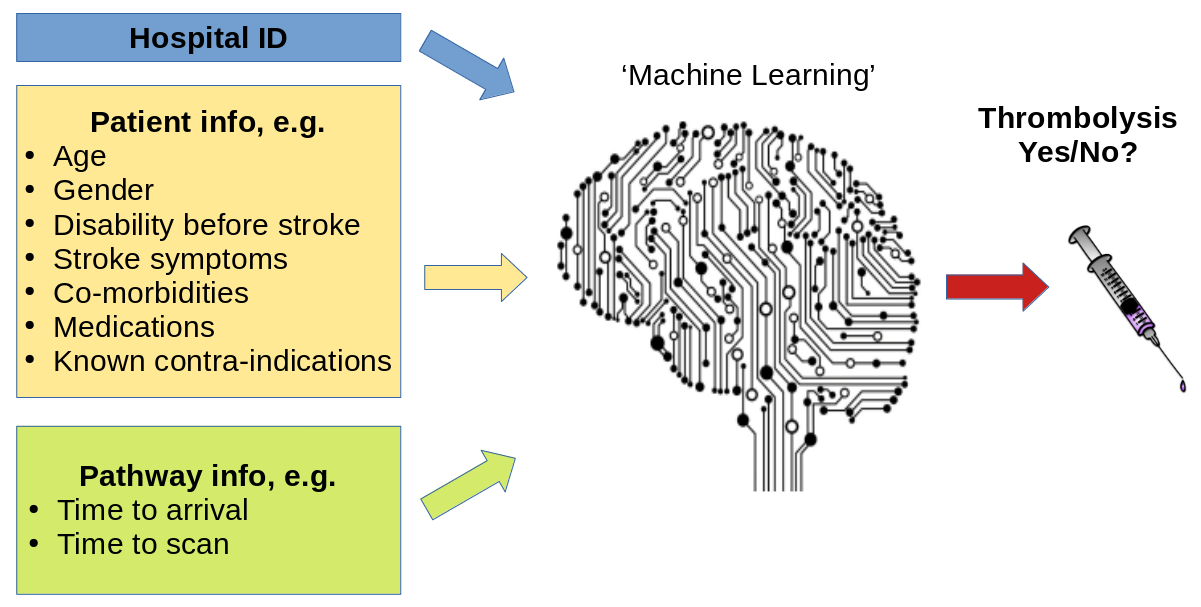
Fig. 6 A general depiction of machine learning models trained to predict use of thrombolysis for any patient given 1) the hospital they attend, 2) patient and clinical information, and 3) pathway and process information.#
There are many different types of machine learning (here we use one called XG-Boost), but all are making predictions based on similarities to what the model has seen before. Many machine learning models are what we call a black box model - that is we give it some information, and it makes a prediction, but we don’t know why it made that particular prediction.
Explainable Machine Learning seeks to be able to communicate why a model makes the prediction it does. We seek to understand, and communicate, the general patterns that the model is making (we call this global explainability), as well as why the model made the prediction it did for one particular patient (we call this local explainability). We also try to explain other important aspects about the model such as where the training data came from (and how representative is that data of where the model will be used in practice), and how sure we can be of the model’s predictions - both generally and for any particular prediction.
In this project we are very much on a journey - discovering what different people would like to know about the model. Do patients, carers, clinicians, and other machine learning researchers all want to know the same things, or different things? How can we tailor explainable machine learning output to the wishes of different audiences?
(Explainable machine learning may also be known as Explainable ML, Explainable artificial intelligence, or Explainable AI).
Methods#
In this study we used a machine learning method called XG-Boost to predict decisions to give thrombolysis at each of 132 hospitals in England and Wales that deal with emergency stroke admissions.
In order to make the model easier to explain, we found the most important features that would predict whether a patient received thrombolysis or not. We found that with just 8 features we could get accuracy that was very close to using all available features. These 8 features were:
S2BrainImagingTime_min: Time from arrival at hospital to scan
S2StrokeType_Infarction: Stroke type: clot (‘infarction’) or bleed (‘haemorrhage’)
S2NihssArrival: Stroke severity (National Institutes of Health Stroke Scale; NIHSS) on arrival
S1OnsetTimeType_Precise: Is stroke onset time known precisely (or estimated)
S2RankinBeforeStroke: Disability level (modified Rankin Scale) before stroke
StrokeTeam: Hospital ID
AFAnticoagulent_Yes: Patient on anticoagulant therapy for atrial fibrillation
S1OnsetToArrival_min: Time from stroke onset to arrival at hospital
Note: The GitHub repository also includes XG-Boost models using all available features.
In order to explain model predictions we used a method called Shapley values, which are described below.
What are Shapley values?#
Shapley values (or SHAP, SHapley Additive exPlanations, values, which is a particular method of estimating Shapley values) are ‘the average expected marginal contribution of one player after all possible combinations have been considered’.
Imagine a pub quiz team with up to 3 people. Any number of people may actually turn up on the night:
There are 8 possible combinations of players (including no-one turning up).
The Shapley value for any team member describes the average difference in score when a particular player is present or absent compared to the average of all combinations of players.
The same principle may be applied in machine learning: How does any one feature (e.g. stroke severity, or age), on average, contribute to the prediction after considering all possible combinations of features? What difference does that feature make to the prediction?
Key findings#
Predicting thrombolysis use with an XG-Boost model#
The five most influential features predicting whether thrombolysis would be given or not were (in order of importance):
Stroke type (infarction vs. haemorrhage): Use of thrombolysis depended on it being an infarction (clot).
Time from arrival at hospital to time brain imaging was performed: Predicted probability of using thrombolysis reduced with increasing time to scan.
Stroke severity (NIHSS) on arrival: Predicted probability of using thrombolysis was low with very mild strokes,rose with increasing severity with a plateau at about NIHSS of 10-20, and then reduced with the most severe strokes.
Stroke onset time type (precise vs. estimated): Predicted probability of using thrombolysis increased with a precisely known onset.
Disability level (Rankin) before stroke: Predicted probability of using thrombolysis reduced with increasing disability before stroke.
Figure 7 shows a violin plot of SHAP values for six features.
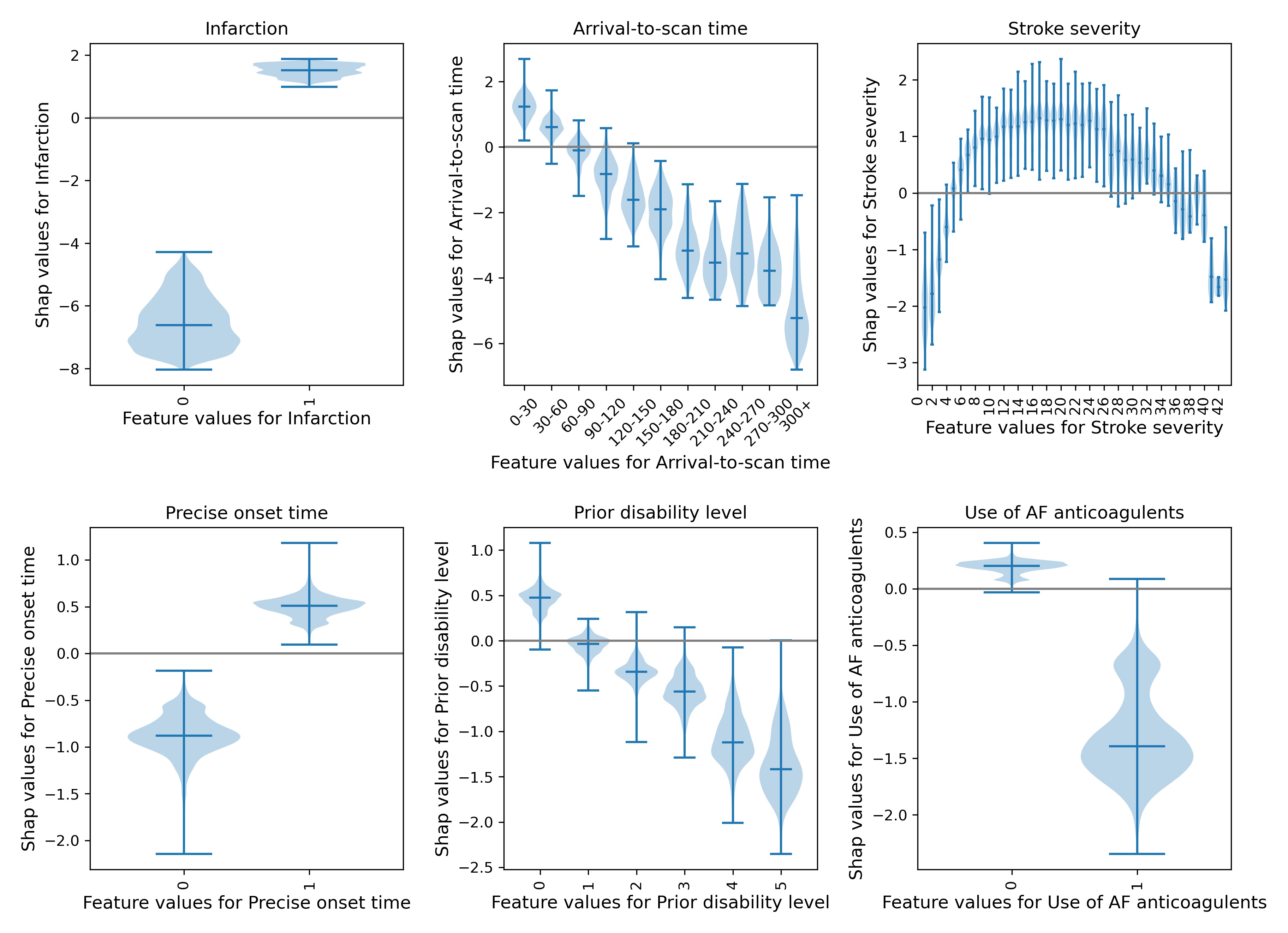
Fig. 7 A violin plot showing the individual SHAP values for six features. The shape of the violin shows the spread of the size of SHAP values for each feature value. A positive SHAP vales pushes the model towards saying that patient would would receive thrombolysis. A negative SHAP value pushes the model towards saying that patient would would not receive thrombolysis.#
SHAP plots can also be used to explain predictions of any individual patient (e.g. Figure 8).
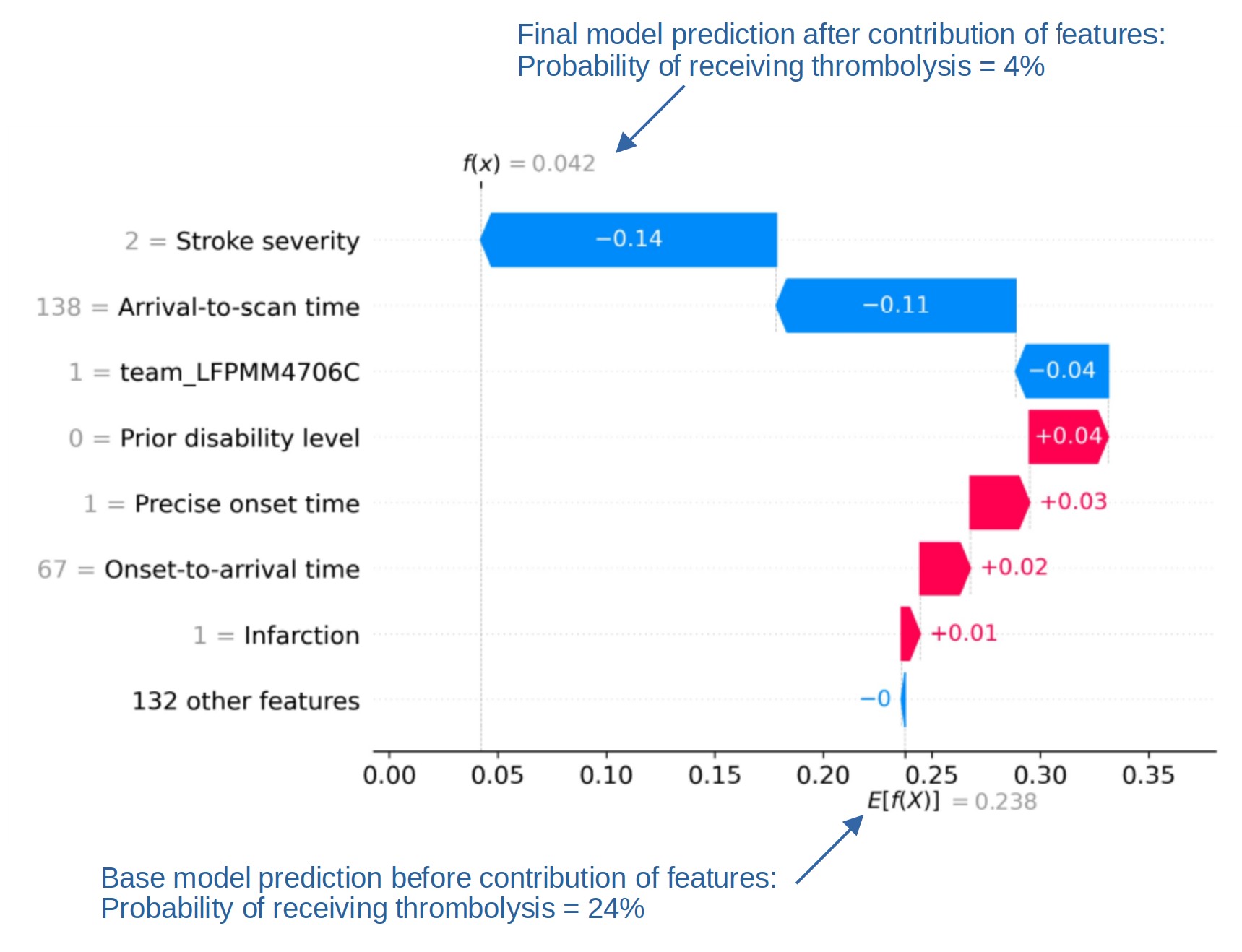
Fig. 8 An example of a SHAP waterfall plot showing the most influential features in influencing the model’s prediction of a patient probability of receiving thrombolysis (in this case a patient with a very low probability of receiving thrombolysis). In this example the three most influential features, reducing the chance of receiving thrombolysis were 1) low stroke severity (NIHSS 2), 2) slow arrival-to-scan time (138 mins), and 3 the hospital attended (stroke team LFPMM4706C).#
Comparing hospital SHAP values with the predicted thrombolysis rate at each hospital if all hospitals saw the same 10k cohort of patients#
We can assess each hospital’s ‘propensity to use thrombolysis’ by passing the same 10k cohort of patients through all hospital prediction models (by keeping all patient features the same apart from changing the hospital ID). In this analysis we train the XGBoost model on all patients apart from those in the 10k patient cohort (which are selected randomly from the full data set), and then assess thrombolysis use in the 10k data set.
When we compare this 10k thrombolysis rate to the average hospital SHAP model in our previously trained XGBoost model (Figure 9), we find a very strong correlation (R-squared = 0.917). This helps to validate average hospital SHAP being used as a measure of a hospital’s ‘propensity to use thrombolysis’.
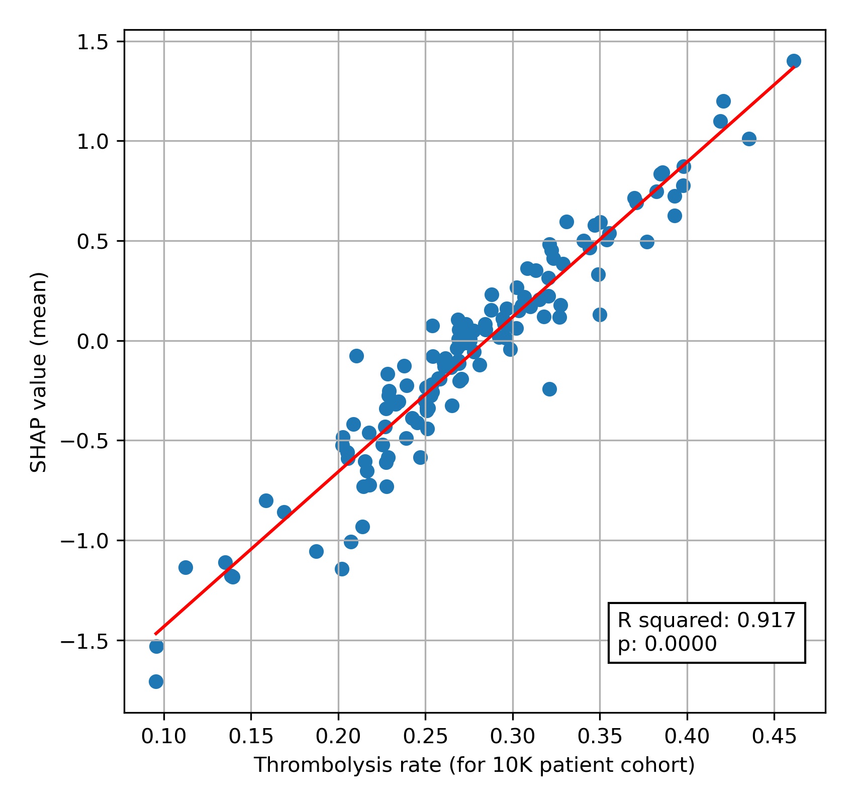
Fig. 9 A comparison of average hospital SHAP values with predicted hospital thrombolysis use if all hospitals saw the same 10k patient cohort,#
Predicting differences in thrombolysis use between hospitals with an XG-Boost model#
We trained an XG-Boost model to predict different choices in thrombolysis between hospitals with a high or low propensity to use thrombolysis. Using this model we found that lower thrombolysing hospitals were less likely to give thrombolysis…
In milder, or very severe, strokes.
With increasing disability before stroke.
When stroke onset time had been estimated (rather than known precisely).
With longer onset-to-arrival times.
With longer arrival-to-scan times.
When patient is on anticoagulants for atrial fibrillation.
We can visualise the general effects of these features, using SHAP in several ways. Firstly we can show the average effect of each feature as a violin plot (figure 10), which shows the spread of the size of average SHAP values for each feature when measured in five different experiments (to understand how reproducible our measurement of SHAP values are). In this type of plot we ignore the direction of the SHAP value - that is we ignore whether a value is positive or negative; SHAP values of -3 or +3 would both have an effect size of 3.
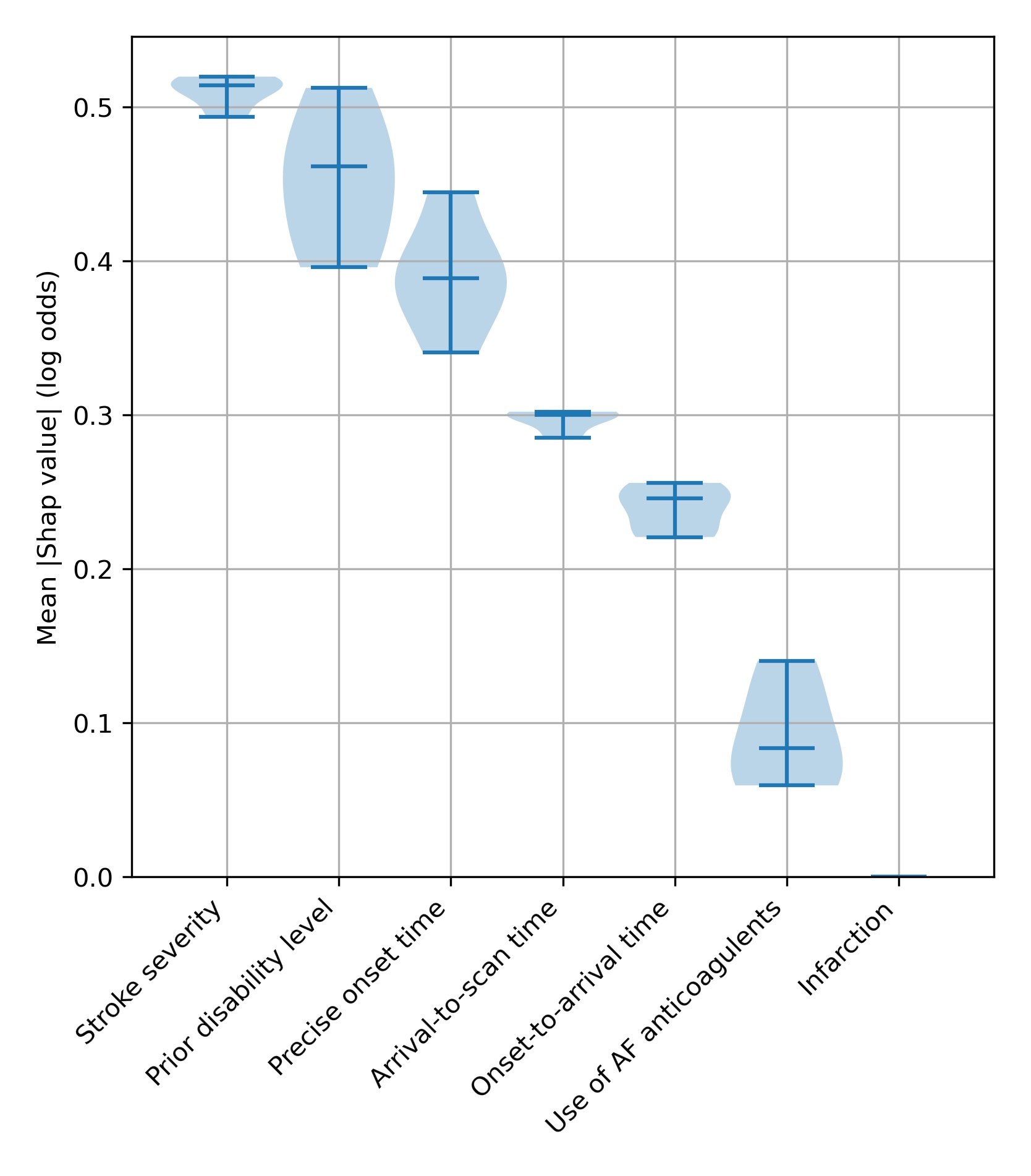
Fig. 10 A violin plot showing how much each feature affects the model prediction, as shown by the average (mean) SHAP value. We measure this in five separate experiments. The shape of the violin shows the spread of the size of SHAP values for each feature over the five experiments - where the violin is wider, there are more data points around that value. The end bars show the lowest and highest values, and the middle bar shows the median value, that is the middle number if all the five average SHAP values were sorted in order.#
A second way to visualise the effects of the features is to plot a beeswarm plot (Figure 11). In this case we plot all the individual SHAP values, along with an indicator of the feature value.
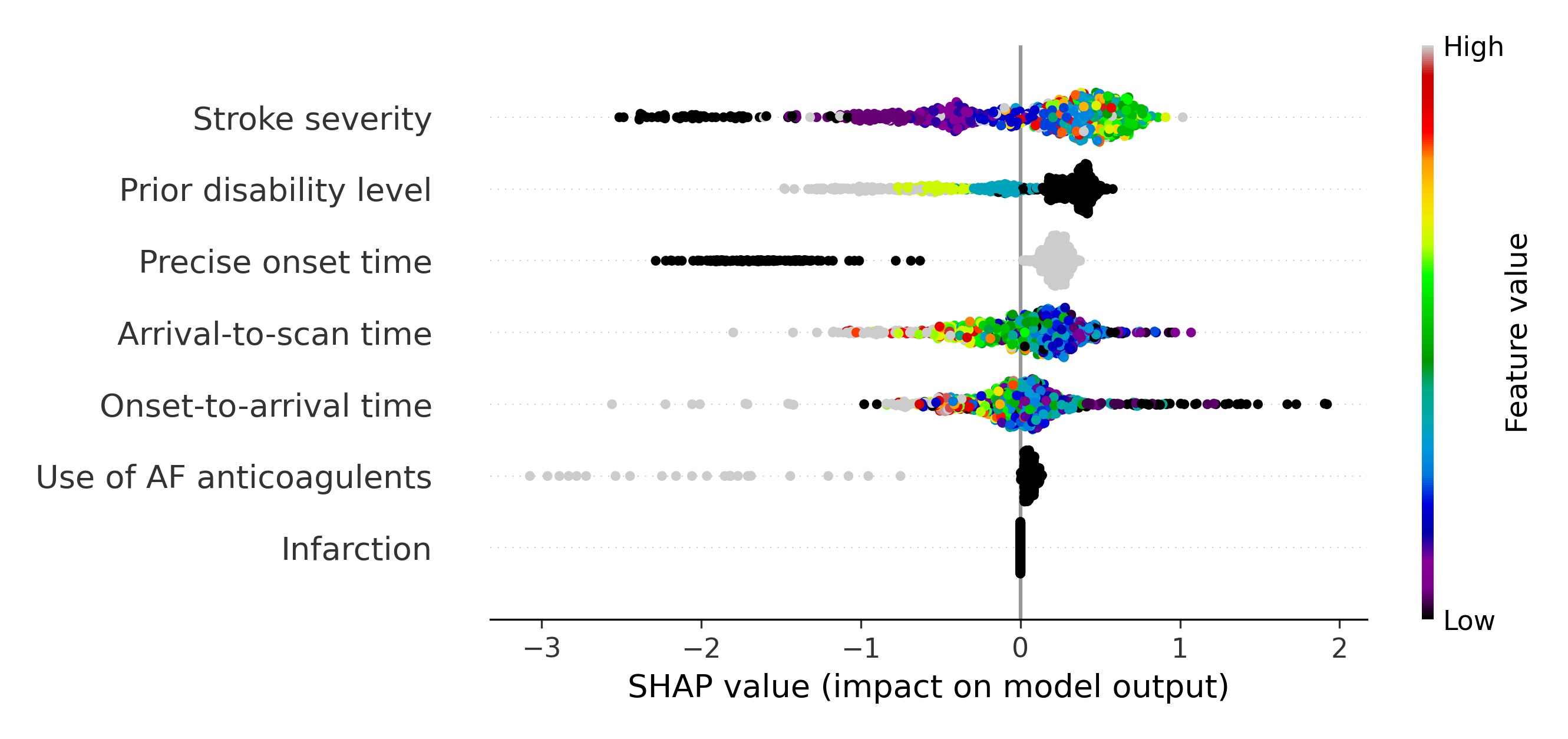
Fig. 11 A beeswarm plot of SHAP values, along with feature value (shown by the colour of the point) for all features. Black or blue points have low feature value (e.g. low prior disability level), and yellow/red/grey points have high feature value (e.g. high prior disability level), with green points being in the middle of the range of feature values. A positive SHAP vales pushes the model towards saying that patient would have different treatment to the benchmark hospitals, that is the patient would not receive thrombolysis. A negative SHAP vales pushes the model towards saying that patient would have the same treatment to the benchmark hospitals, that is the patient would receive thrombolysis.#
We may examine each feature in more detail using violin plots for each feature (Figure 12)
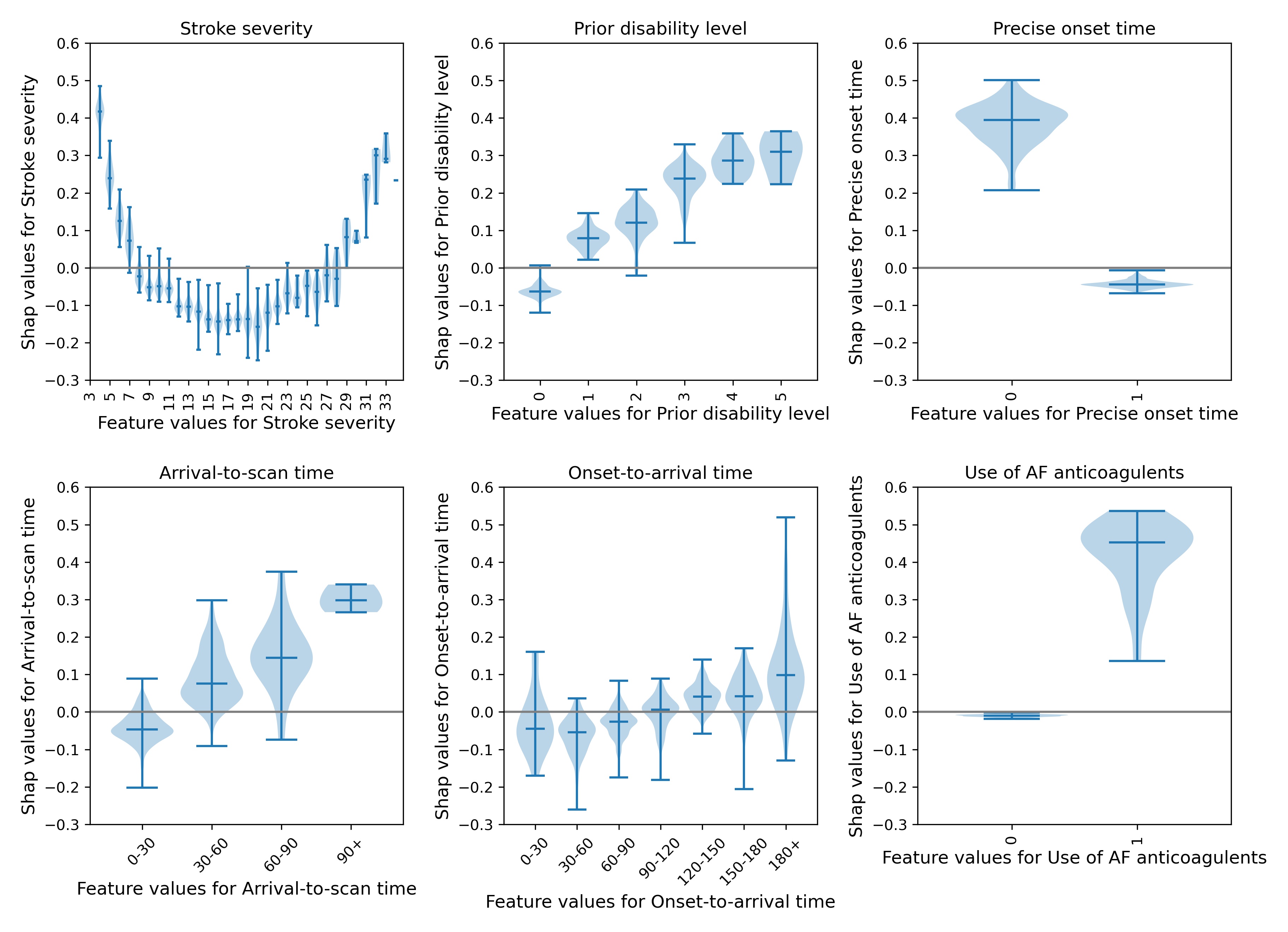
Fig. 12 A violin plot showing the individual SHAP values for six features. The shape of the violin shows the spread of the size of SHAP values for each feature value. A positive SHAP vales pushes the model towards saying that the patient would have different treatment to the benchmark hospitals, that is the patient would not receive thrombolysis. A negative SHAP vales pushes the model towards saying that patient would have the same treatment to the benchmark hospitals, that is the patient would receive thrombolysis.#
Conclusions#
Explainable machine learning techniques give significant insight into models prediction clinical decision-making. At an overall level, SHAP allows for an understanding of the relationship between feature values and the model prediction, and at an individual level SHAP allows for an understanding of the most influential features in any single prediction.