A simple worked example of Shap
Contents
A simple worked example of Shap#
This notebook shows a very simple example of Shap. We examine scores in a pub quiz. Those scores depend on the players present (Tim, Mark, and Carrie). The pub quiz team can have any number and combination of players - including none of the team turning up!
Data has been generated according to a known algorithm:
Add 3 marks if Tim is present
Add 6 marks if Mark is present
Add 9 marks if Carrie is present
Add 0-20% (as an integer)
We then fit an XGBoost regressor model to predict the score given any number and combination of players, and then fit a Shap model to explore the XGBoost model.
Note: Shap values are usually reported as log odds shifts in model predictions. For a description of the relationships between probability, odds, and Shap values (log odds shifts) see here.
# Turn warnings off to keep notebook tidy
import warnings
warnings.filterwarnings("ignore")
import matplotlib.pyplot as plt
import numpy as np
import pandas as pd
import shap

from sklearn import metrics
from sklearn.linear_model import LinearRegression
from xgboost import XGBRegressor
Load data#
scores = pd.read_csv('shap_example.csv')
Show first eight scores (a single set of all combinations).
scores.head(8)
| Tim | Mark | Carrie | Score | |
|---|---|---|---|---|
| 0 | 0 | 0 | 0 | 0 |
| 1 | 1 | 0 | 0 | 4 |
| 2 | 0 | 1 | 0 | 6 |
| 3 | 0 | 0 | 1 | 11 |
| 4 | 1 | 1 | 0 | 11 |
| 5 | 1 | 0 | 1 | 14 |
| 6 | 0 | 1 | 1 | 15 |
| 7 | 1 | 1 | 1 | 19 |
Calculate average of all games#
Shap values show change from the global average of all scores.
global_average = scores['Score'].mean()
print(f'Global average: {global_average:0.1f}')
Global average: 9.8
Show averages by whether player is present or not#
Show averages by whether player is present or not, and show difference from average score.
players = ['Tim', 'Mark', 'Carrie']
for player in players:
    print(f'Average scores wrt {player}')
    average_scores = scores.groupby(player).mean()['Score']
    print(average_scores.round(1))
    print('\nDifference from average:')
    difference = average_scores - global_average
    print(difference.round(1))
    print('\n')
Average scores wrt Tim
Tim
0     8.1
1    11.6
Name: Score, dtype: float64

Difference from average:
Tim
0   -1.8
1    1.8
Name: Score, dtype: float64


Average scores wrt Mark
Mark
0     6.8
1    12.8
Name: Score, dtype: float64

Difference from average:
Mark
0   -3.0
1    3.0
Name: Score, dtype: float64


Average scores wrt Carrie
Carrie
0     5.2
1    14.4
Name: Score, dtype: float64

Difference from average:
Carrie
0   -4.6
1    4.6
Name: Score, dtype: float64
Split into X and y and fit XGBoost regressor model#
X = scores.drop('Score', axis=1)
y = scores['Score']
# Define model
model = XGBRegressor()

# Fit model
model.fit(X, y)
XGBRegressor(base_score=0.5, booster='gbtree', colsample_bylevel=1,
             colsample_bynode=1, colsample_bytree=1, enable_categorical=False,
             gamma=0, gpu_id=-1, importance_type=None,
             interaction_constraints='', learning_rate=0.300000012,
             max_delta_step=0, max_depth=6, min_child_weight=1, missing=nan,
             monotone_constraints='()', n_estimators=100, n_jobs=36,
             num_parallel_tree=1, predictor='auto', random_state=0, reg_alpha=0,
             reg_lambda=1, scale_pos_weight=1, subsample=1, tree_method='exact',
             validate_parameters=1, verbosity=None)
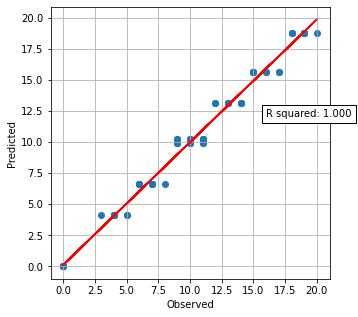
Get predictions and plot observed vs. predicted#
(Predicted includes a random component to score, so no model can be exact).
y_pred = model.predict(X)
y_array = np.array(y).reshape(-1,1)
y_pred_array = np.array(y_pred).reshape(-1,1)
slr = LinearRegression()
slr.fit(y_array, y_pred_array)
y_pred_best_fit = slr.predict(y_array)
r_square = metrics.r2_score(y_array, y_pred_best_fit)
fig = plt.figure(figsize=(5,5))
ax = fig.add_subplot()
ax.scatter(y, y_pred)
ax.set_xlabel('Observed')
ax.set_ylabel('Predicted')

ax.plot (y, slr.predict(y_array), color = 'red')
text = f'R squared: {r_square:.3f}'
ax.text(16, 12, text,
         bbox=dict(facecolor='white', edgecolor='black'))
ax.grid()
plt.show()
Train Shap model#
# Train explainer on Training set
explainer = shap.TreeExplainer(model, X)

# Get Shapley values along with base and features
shap_values_extended = explainer(X)
shap_values = shap_values_extended.values
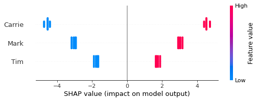
Show beeswarm of Shap#
The Beeswarm plot shows the Shap values for each instance predicted. Each player has a Shap value for their presence or absence in a team, which shows the effect of their presence/absence compared with the global average of all scores.
features = list(X)

shap.summary_plot(shap_values=shap_values,
                  features=X,
                  feature_names=features,
                  show=False)
plt.show()
Calculate Shap for each player when present or not#
Here we calculate the average Shap values for the absence and presence of a player in the team.
shap_summary_by_player = dict()
for player in list(X):
    player_shap_values = shap_values_extended[:, player]
    df = pd.DataFrame()
    df['player_present'] = player_shap_values.data
    df['shap'] = player_shap_values.values
    shap_summary = df.groupby('player_present').mean()
    shap_summary_by_player[player] = shap_summary
for player in list(X):
    print (f'Shap for {player}:')
    print(shap_summary_by_player[player].round(1))
    print()
Shap for Tim:
                shap
player_present
0               -1.7
1                1.7

Shap for Mark:
                shap
player_present
0               -3.0
1                3.0

Shap for Carrie:
                shap
player_present
0               -4.6
1                4.6
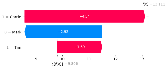
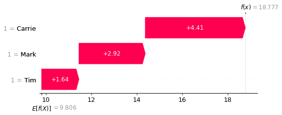
Show waterfall plots for lowest and highest scores#
Waterfall plots show the influence of features on the predicted outcome starting from a baseline model prediction.
Here we show the lowest and highest score.
# Get the location of an example each where probability of giving thrombolysis
# is <0.1 or >0.9

location_low_score = np.where(y_pred == np.min(y_pred))[0][0]
location_high_score = np.where(y_pred == np.max(y_pred))[0][0]
fig = shap.plots.waterfall(shap_values_extended[location_low_score])
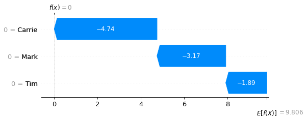
fig = shap.plots.waterfall(shap_values_extended[location_high_score])
Pick a random example.
random_location = np.random.randint(0, len(scores))
fig = shap.plots.waterfall(shap_values_extended[random_location])