Distance-based treatment effects#
This notebook is a basic example of a grid of generic geography with different travel times to different stroke units and the effects of travel time on outcomes.
The grid and resulting circle plots are based on the figures from Holodinsky et al. 2017 - “Drip and Ship Versus Direct to Comprehensive Stroke Center”.
Plain English summary#
People who are having a stroke need to get to a hospital as quickly as possible for treatment. We can test the effects of the time to treatment by changing various times in the stroke pathway, for example the time between the 999 call and the ambulance arriving or the time between arrival at the hospital and the start of the treatment. However we cannot change the actual travel time of patients from their homes to the hospitals. This means it is important to know how the time to treatment and so the outcomes after treatment will depend on the travel time to the hospital.
We can look at the travel times in the real world by using a map of part of England and Wales. However this is complicated and requires many assumptions. Perhaps a patient at a point far away in distance from the hospital is very close to a motorway and can span the large distance quickly. Perhaps a patient nearby as the crow flies actually lives down a long narrow twisty road that has to be navigated slowly. If you were looking at a map of an unfamiliar part of the country, you wouldn’t know about these details and it would make the map harder to interpret at first glance.
Instead of using a real world map we can make our own generic geography that gets rid of all of the assumptions of the real world. We can get rid of hills and twisty roads and have a constant travel speed everywhere. Then the travel time to the hospital just depends on the distance to it.
This generic grid is more powerful when we are considering two stroke units. For a patient located at any point on the grid, we can immediately see their travel time to the nearest stroke unit and how much further it is to the other option. Every point on the grid will have a different combination of travel time to the nearest unit and travel time to the second unit. This lets us draw conclusions about travel time differences in general. If we want to, we can then apply those results to specific parts of England and Wales.
Aims#
Plot the difference in travel times at any point on a grid of generic geography.
Plot the difference in expected outcomes after treatment based on those travel times.
Method#
Travel times:
Create a grid. Set the IVT centre to be in the centre and the MT centre to be at the bottom in the middle.
Find the travel time from each point on the grid to the IVT centre.
Find the travel time from each point on the grid to the MT centre.
Find the difference in travel times.
Outcomes:
Add the fixed stroke pathway times to the travel times to find a different time to treatment at each point on the grid.
Feed these treatment times into the stroke outcome model.
Plot the difference in outcomes from attending the IVT centre and from attending the MT centre. The differences will vary around the grid.
Notebook admin#
# Import packages
import numpy as np
import matplotlib.pyplot as plt
import pandas as pd
import copy

from stroke_outcome.continuous_outcome import Continuous_outcome
# Set up MatPlotLib
%matplotlib inline
# Keep notebook cleaner once finalised
import warnings
warnings.filterwarnings('ignore')
Define travel time grids#
For each point on a grid, find the travel time to a given coordinate (one of the treatment centres).
The treatment centres are located at the following coordinates:
Centre |
x |
y |
|---|---|---|
IVT |
0 |
0 |
IVT/MT |
0 |
\(-t_{\mathrm{travel}}^{\mathrm{IVT~to~MT}}\) |
travel_ivt_to_mt = 50
ivt_coords = [0, 0]
mt_coords  = [0, -travel_ivt_to_mt]
Change these parameters:
# Only calculate travel times up to this x or y displacement:
time_travel_max = 80

# Change how granular the grid is.
grid_step = 1 # minutes

# Make the grid a bit larger than the max travel time:
grid_xy_max = time_travel_max + grid_step*2
Define a helper function to build the time grid:
def make_time_grid(
        xy_max,
        step,
        x_offset=0,
        y_offset=0
    ):
    # Times for each row....
    x_times = np.arange(-xy_max, xy_max + step, step) - x_offset
    # ... and each column.
    y_times = np.arange(-xy_max, xy_max + step, step) - y_offset
    # The offsets shift the position of (0,0) from the grid centre
    # to (x_offset, y_offset). Distances will be calculated from the
    # latter point.

    # Mesh to create new grids by stacking rows (xx) and columns (yy):
    xx, yy = np.meshgrid(x_times, y_times)

    # Then combine the two temporary grids to find distances:
    radial_times = np.sqrt(xx**2.0 + yy**2.0)
    return radial_times
Build the grids:
grid_time_travel_directly_to_ivt = make_time_grid(
    grid_xy_max,
    grid_step,
    x_offset=ivt_coords[0],
    y_offset=ivt_coords[1]
)
grid_time_travel_directly_to_mt = make_time_grid(
    grid_xy_max,
    grid_step,
    x_offset=mt_coords[0],
    y_offset=mt_coords[1]
)
grid_time_travel_directly_diff = (
    grid_time_travel_directly_to_ivt - grid_time_travel_directly_to_mt)
extent = [
    -grid_xy_max - grid_step*0.5,
    +grid_xy_max - grid_step*0.5,
    -grid_xy_max - grid_step*0.5,
    +grid_xy_max - grid_step*0.5
]
Plot travel time grids#
Setup for plots:
titles = [
    'Travel time'+'\n'+'directly to IVT centre',
    'Travel time'+'\n'+'directly to MT centre',
    'Difference in travel time'+'\n'+'(IVT centre minus MT centre)'
    ]

cbar_labels = [
    'Travel time (mins)',
    'Difference in travel time (mins)'
    ]
Import this function to make the plots:
from outcome_utilities.geography_plot import plot_two_grids_and_diff
plot_two_grids_and_diff(
    grid_time_travel_directly_to_ivt,
    grid_time_travel_directly_to_mt,
    grid_time_travel_directly_diff,
    titles=titles,
    cbar_labels=cbar_labels,
    extent=extent,
    cmaps=['viridis_r', 'RdBu'],
    ivt_coords=ivt_coords,
    mt_coords=mt_coords
    )
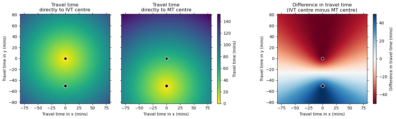
On the difference grid, positive values are nearer the IVT/MT centre and negative nearer the IVT-only centre. There is a horizontal line halfway between the two treatment centres that marks where the travel times to the two treatment centres are equal.
Presumably the curves in the difference grid match the ones drawn in the Holodinsky et al. 2017 paper.
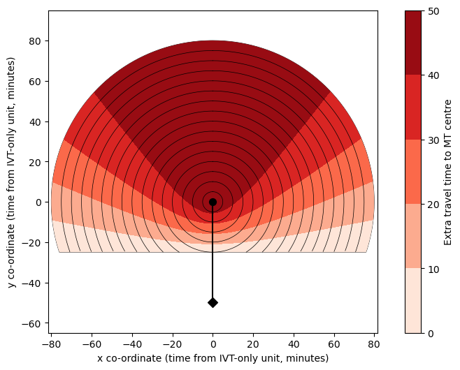
Plot travel time circles#
To help define colour limits (vmin and vmax), gather the coordinates within the largest flattened radiating circle:
from outcome_utilities.geography_plot import find_mask_within_flattened_circle
grid_mask = find_mask_within_flattened_circle(
    grid_time_travel_directly_diff,
    grid_time_travel_directly_to_ivt,
    time_travel_max
)

coords_valid = np.where(grid_mask<1)
vmin_time = np.nanmin(-grid_time_travel_directly_diff[coords_valid])
vmax_time = np.nanmax(-grid_time_travel_directly_diff[coords_valid])
Update plotting style:
time_step_circle = 5
circ_linewidth = 0.5
from outcome_utilities.geography_plot import circle_plot
circle_plot(
    -grid_time_travel_directly_diff,
    travel_ivt_to_mt,
    time_travel_max,
    time_step_circle,
    vmin_time,
    vmax_time,
    imshow=0,
    cbar_label='Extra travel time to MT centre',
    extent=extent,
    ivt_coords=ivt_coords,
    mt_coords=mt_coords,
    cmap='Reds',
    n_contour_steps=5,
    circ_linewidth=circ_linewidth,
    )
Feed time grid into the outcome model#
For simplicity, we’ll just show a basic example here.
We’ll calculate some times to thrombectomy by adding a fixed time to the travel time grids.
extra_pathway_time = 42 # minutes
Time to treatment when a transfer between centres is required:
grid_time_mt_centre1_centre2 = (
    grid_time_travel_directly_to_ivt + travel_ivt_to_mt + extra_pathway_time
)
Time to treatment when the MT centre was travelled to directly:
grid_time_mt_centre2 = (
    grid_time_travel_directly_to_mt + extra_pathway_time
)
Flatten the grids into columns of data and create the other inputs for the outcome model.
df_mt_centre1_centre2 = pd.DataFrame()
df_mt_centre1_centre2['onset_to_puncture_mins'] = grid_time_mt_centre1_centre2.flatten()
df_mt_centre1_centre2['onset_to_needle_mins'] = 0.0
df_mt_centre1_centre2['stroke_type_code'] = 2
df_mt_centre1_centre2['ivt_chosen_bool'] = 0
df_mt_centre1_centre2['mt_chosen_bool'] = 1
df_mt_centre2 = pd.DataFrame()
df_mt_centre2['onset_to_puncture_mins'] = grid_time_mt_centre2.flatten()
df_mt_centre2['onset_to_needle_mins'] = 0.0
df_mt_centre2['stroke_type_code'] = 2
df_mt_centre2['ivt_chosen_bool'] = 0
df_mt_centre2['mt_chosen_bool'] = 1
Set up the outcome model:
# Set up outcome model
outcome_model = Continuous_outcome()
dfs = [df_mt_centre1_centre2, df_mt_centre2]

for df in dfs:
    outcome_model.assign_patients_to_trial(df)

    # Calculate outcomes:
    patient_data_dict, outcomes_by_stroke_type, full_cohort_outcomes = (
        outcome_model.calculate_outcomes())

    # Make a copy of the results:
    outcomes_by_stroke_type = copy.copy(outcomes_by_stroke_type)
    full_cohort_outcomes = copy.copy(full_cohort_outcomes)

    # Place the relevant results into the starting dataframe:
    df['added_utility'] = full_cohort_outcomes['each_patient_utility_shift']
    df['mean_mrs'] = full_cohort_outcomes['each_patient_mrs_post_stroke']
    df['mrs_less_equal_2'] = full_cohort_outcomes['each_patient_mrs_dist_post_stroke'][:, 2]
    df['mrs_shift'] = full_cohort_outcomes['each_patient_mrs_shift']
Calculate difference grid:
df_mt_diff = df_mt_centre1_centre2 - df_mt_centre2
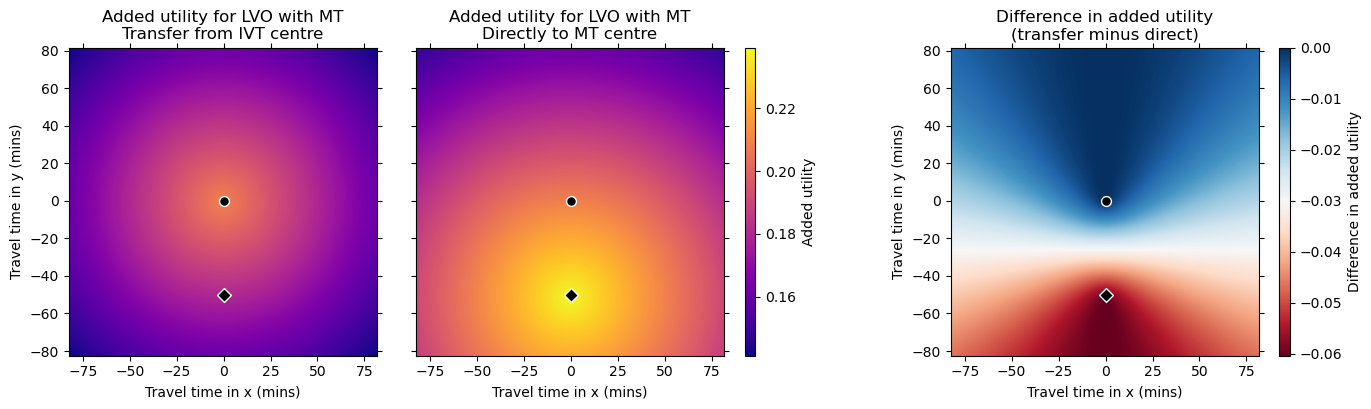
Plot the outcomes#
Setup:
outcome_col = 'added_utility'
cmap = 'plasma'

titles = [
    'Added utility for LVO with MT'+'\n'+'Transfer from IVT centre',
    'Added utility for LVO with MT'+'\n'+'Directly to MT centre',
    'Difference in added utility'+'\n'+'(transfer minus direct)'
    ]

cbar_labels = [
    'Added utility',
    'Difference in added utility'
    ]
Plot grids:
plot_two_grids_and_diff(
    df_mt_centre1_centre2[outcome_col].values.reshape(grid_time_mt_centre1_centre2.shape),
    df_mt_centre2[outcome_col].values.reshape(grid_time_mt_centre1_centre2.shape),
    df_mt_diff[outcome_col].values.reshape(grid_time_mt_centre1_centre2.shape),
    titles=titles,
    cbar_labels=cbar_labels,
    extent=extent,
    cmaps=[cmap, 'RdBu'],
    ivt_coords=ivt_coords,
    mt_coords=mt_coords
    )
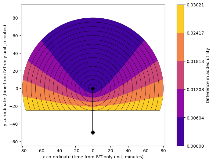
Plot circles:
Use the same grid mask and so valid coordinates from the travel time circle plot earlier.
vmin = np.nanmin(-df_mt_diff[outcome_col].values.reshape(grid_time_mt_centre1_centre2.shape)[coords_valid])
vmax = np.nanmax(-df_mt_diff[outcome_col].values.reshape(grid_time_mt_centre1_centre2.shape)[coords_valid])
Update plotting style:
time_step_circle = 5
circ_linewidth = 0.5
circle_plot(
    -df_mt_diff[outcome_col].values.reshape(grid_time_mt_centre1_centre2.shape),
    travel_ivt_to_mt,
    time_travel_max,
    time_step_circle,
    vmin,
    vmax,
    imshow=0,
    cbar_label='Difference in added utility',
    extent=extent,
    ivt_coords=ivt_coords,
    mt_coords=mt_coords,
    cmap='plasma',
    n_contour_steps=5,
    circ_linewidth=circ_linewidth,
    )
Conclusion#
We have shown the basic method to find:
a grid of travel times
a grid of outcomes
the difference in travel times and outcomes from attending the nearer or the farther stroke unit.
And we have shown how these can be plotted as circle plots.
We see that a grid of travel times or outcomes to a single unit will show a circle pattern, and that the difference between two grids based on travel to different stroke units creates a curve pattern.
We see that the improvement in outcomes through redirection is greatest in areas nearer the MT unit (bottom of the plots, lower difference in travel time) and smallest in areas farther away from the MT unit (top of the plots, higher difference in travel time).
In the next notebook we will calculate these outcomes and combine the results for an example patient population.